Image Distill
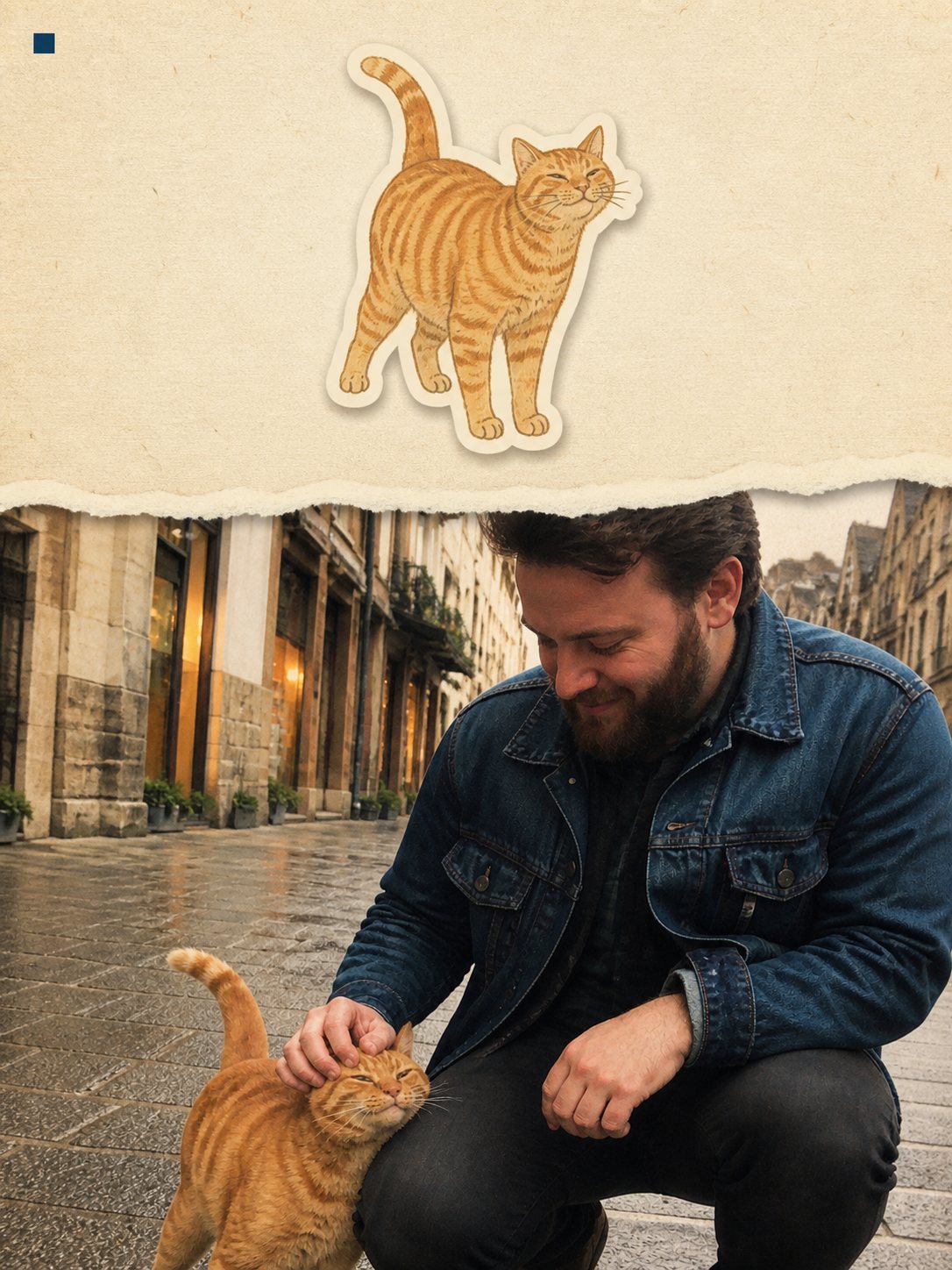
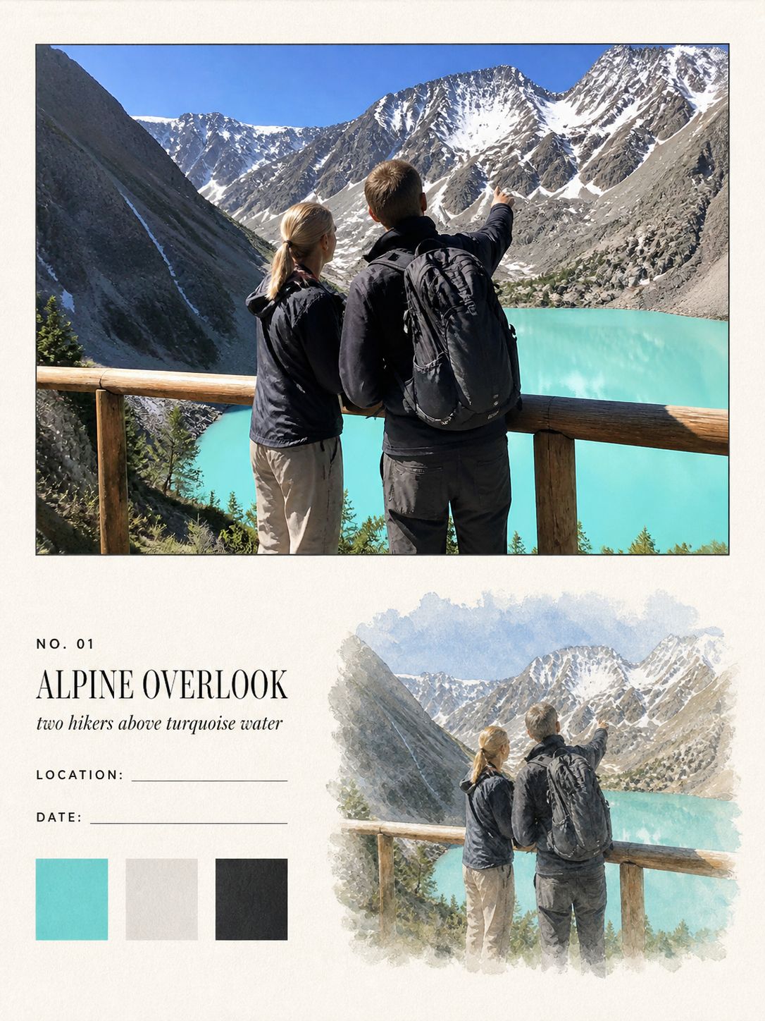
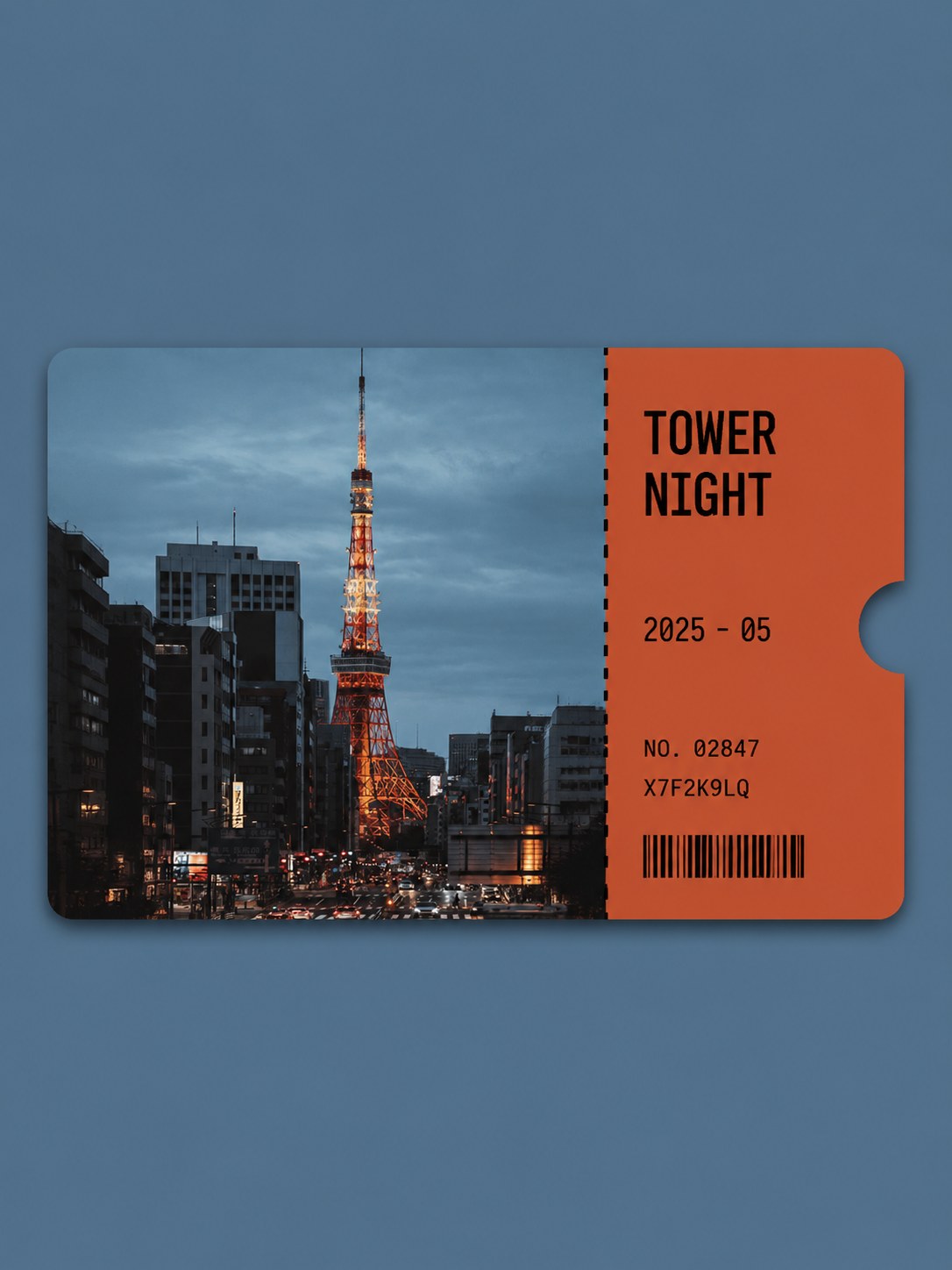
Travel sticker card
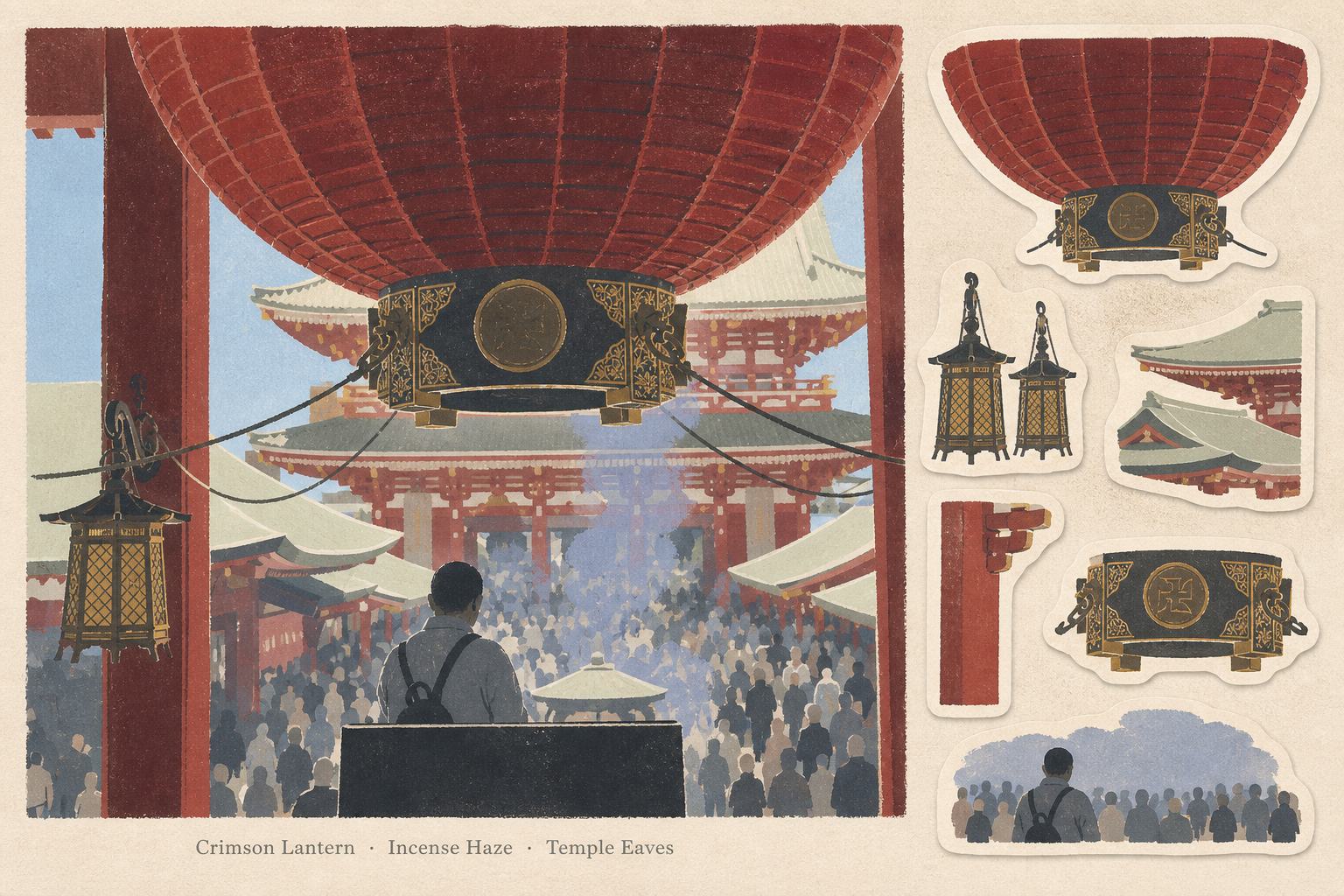
A keepsake card with six die-cut stickers
- Ratio
- Original, 3:4, 4:5, 1:1, 9:16, 4:3, 16:9 or 2.35:1
- Options
- None
- Origin
- Distilled from an open-source GitHub skill · carolinaaafy/travel-memory-sticker-card
- GitHub skill
- Install for Codex ↗
Each generation costs credits — see your balance in My space.
Create with this styleSamples
Real generations, not mockups.
Where this style came from
This is a distillation of an open-source skill for turning travel photos into collectible memory cards. The upstream repository already contained a well-developed layout — the two-thirds/one-third split, the six stickers, the three keywords — and most of our work was compression rather than invention.
What we did change was the vagueness. The original described the illustration style in adjectives; we replaced them with counts and percentages wherever a number would hold. The scene is now rebuilt from five to eight colour families, the first read has to be three to six oversized shapes, vegetation compresses into one to three masses. Adjectives get interpreted differently every run; numbers do not.
The keyword rule needed the most attention. Left alone, models write “Travel”, “Memories”, “Beautiful Day” — words that describe the category rather than the photograph. The instruction now says the keywords must be grounded in the scene, the light or the objects, and it gives examples of the register we want. It still fails occasionally, which is the honest state of any prompt that asks a model to write.
The sticker-count option in the upstream skill — six or four — we deliberately did not ship. Four looks airier in isolation but breaks the column rhythm against the main illustration, and an option that makes half its outputs worse is not an option, it is a trap.
What is in the prompt
- Layout
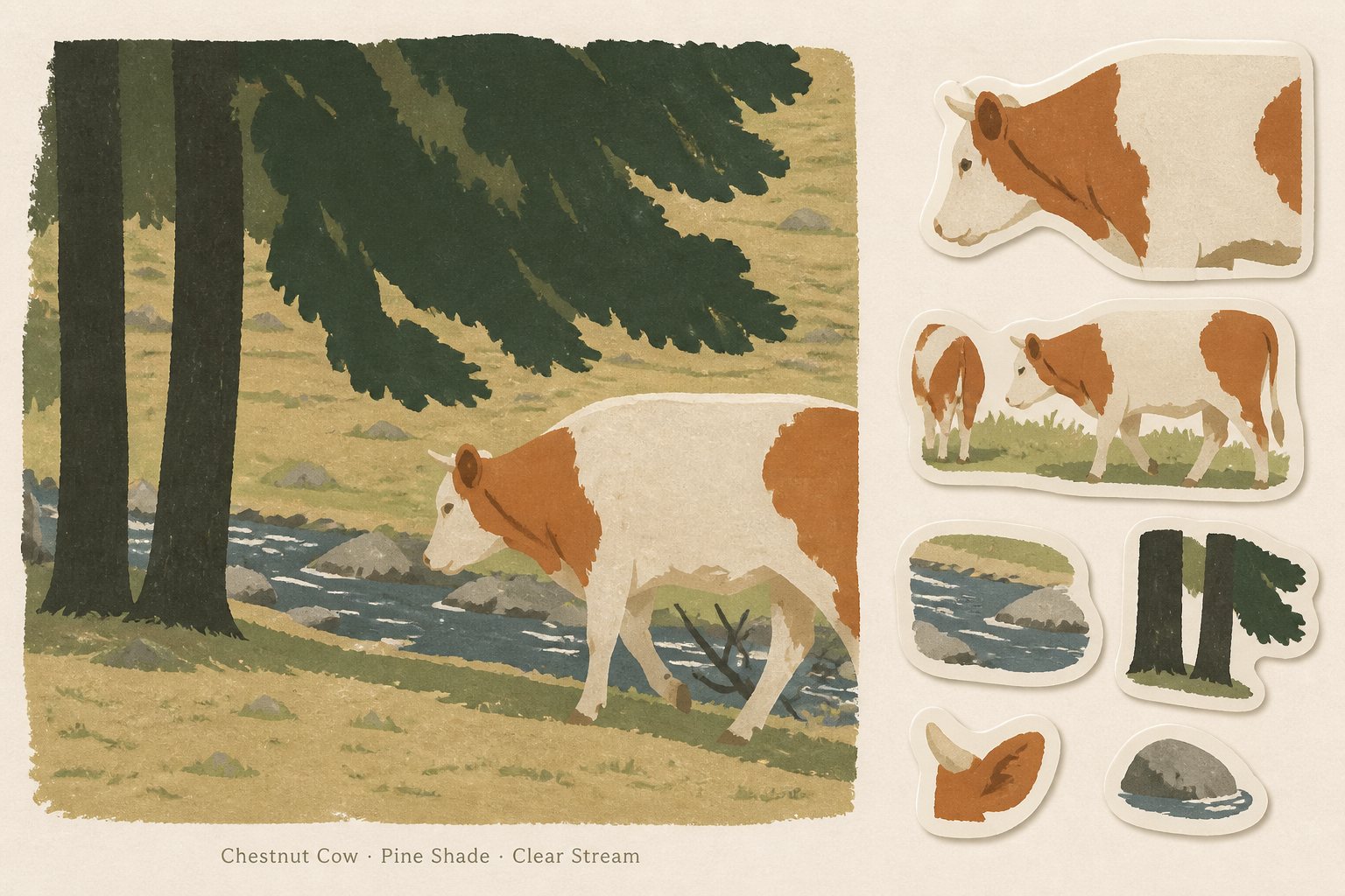
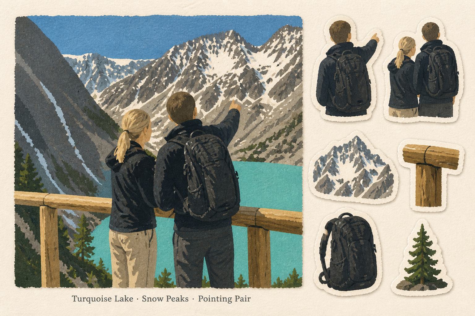
- A card on warm uncoated paper. One large illustration and six die-cut stickers sit side by side in landscape, or stack in portrait and square formats.
- The six stickers
- Each motif has to come from something visible in your photo — a fragment of the main subject, an environmental form, a structural piece, a functional object, a scale cue. Every sticker gets a thick hand-cut white border and a flat paper shadow.
- Three keywords
- Under the illustration sit exactly three English keywords separated by dots. They must be grounded in the scene, the light or the objects — "Crater Smoke", not "Travel".
- Palette
- The whole scene is rebuilt from five to eight matte colour families sampled from your photo. Dusty midtones, flat colour shadows, no gradients, near-black used sparingly.
- Simplification
- The first read has to be three to six oversized blunt shapes. Vegetation compresses into one to three lumpy masses, buildings into planes, people into compact faceless silhouettes.
- Recognition anchor
- One compact thing from your photo keeps its silhouette, proportions, placement and signature colours — so the card still points at a specific place, not a generic one.
- What it refuses
- No title, date, postal marks or writing area. No photographic patches, no watercolour washes, no glossy 3D, no detailed faces or anatomy.
The full production prompt is built into generation and is not published.
Take the prompt with you
A distilled public version of this style. Paste it into any image model and swap {subject} for your own scene.
One finished 3:2 horizontal collectible travel memory card of {subject} on warm off-white textured paper. Left two-thirds: a large flat matte illustration of the scene rebuilt from five to eight dusty muted color families in an opaque gouache, risograph and cut-paper feel — broad blunt shapes, flat colored shadows, quiet negative space, people as compact faceless silhouettes. Beneath it, three short precise English keywords separated by centered dots. Right third: six separate die-cut journaling stickers drawn from details of the same scene, each with a thick irregular warm-white hand-cut border and a subtle flat paper shadow. Mood: observational, spacious, lightly nostalgic. No gradients, no photographic textures, no extra text.
Example subject: a volcanic crater lookout with hikers at dawn
Good for / not for
Works well
- Landscapes and outdoor scenes with strong shapes
- Trips with a recognisable landmark or structure
- Photos containing several distinct objects worth cutting out
- Wide shots — the card is landscape
Not this one
- Tight portraits — faces become blank silhouettes
- Photos with only one object and nothing around it
- Scenes whose appeal is fine texture rather than shape
Common questions
Why is it always six stickers?
The sticker region keeps six motifs across every canvas shape. The upstream skill offered a four-sticker variant; we did not ship it as an option, so the number is fixed.
What ratio does it output?
Choose original (the default), 3:4, 4:5, 1:1, 9:16, 4:3, 16:9 or 2.35:1. The layout adapts to your selected canvas.
Will it keep text from my photo?
At most one piece of landmark text, and only if it genuinely locates the place. Ads, menus, prices and timestamps are abstracted away. The default is none.