Hand-drawn Notes
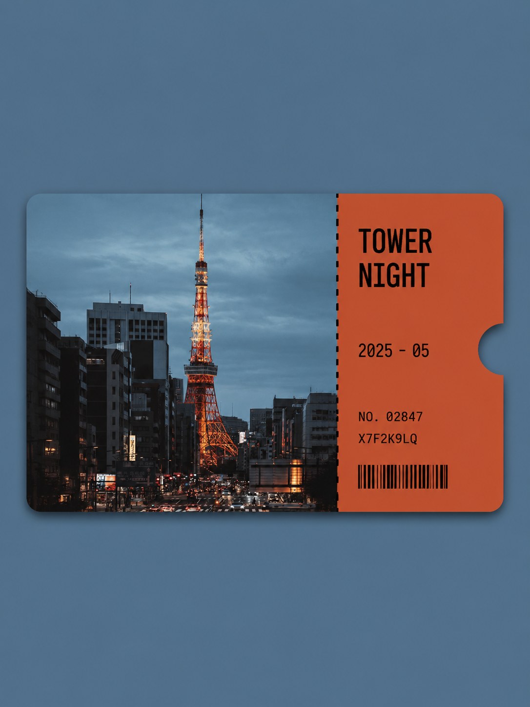
Photo ticket card
Your photo as a collectible ticket stub
- Ratio
- Original, 3:4, 4:5, 1:1, 9:16, 4:3, 16:9 or 2.35:1
- Options
- None
- Origin
- Reverse-engineered from reference images
- GitHub skill
- Install for Codex ↗
Each generation costs credits — see your balance in My space.
Create with this styleSamples
Real generations, not mockups.
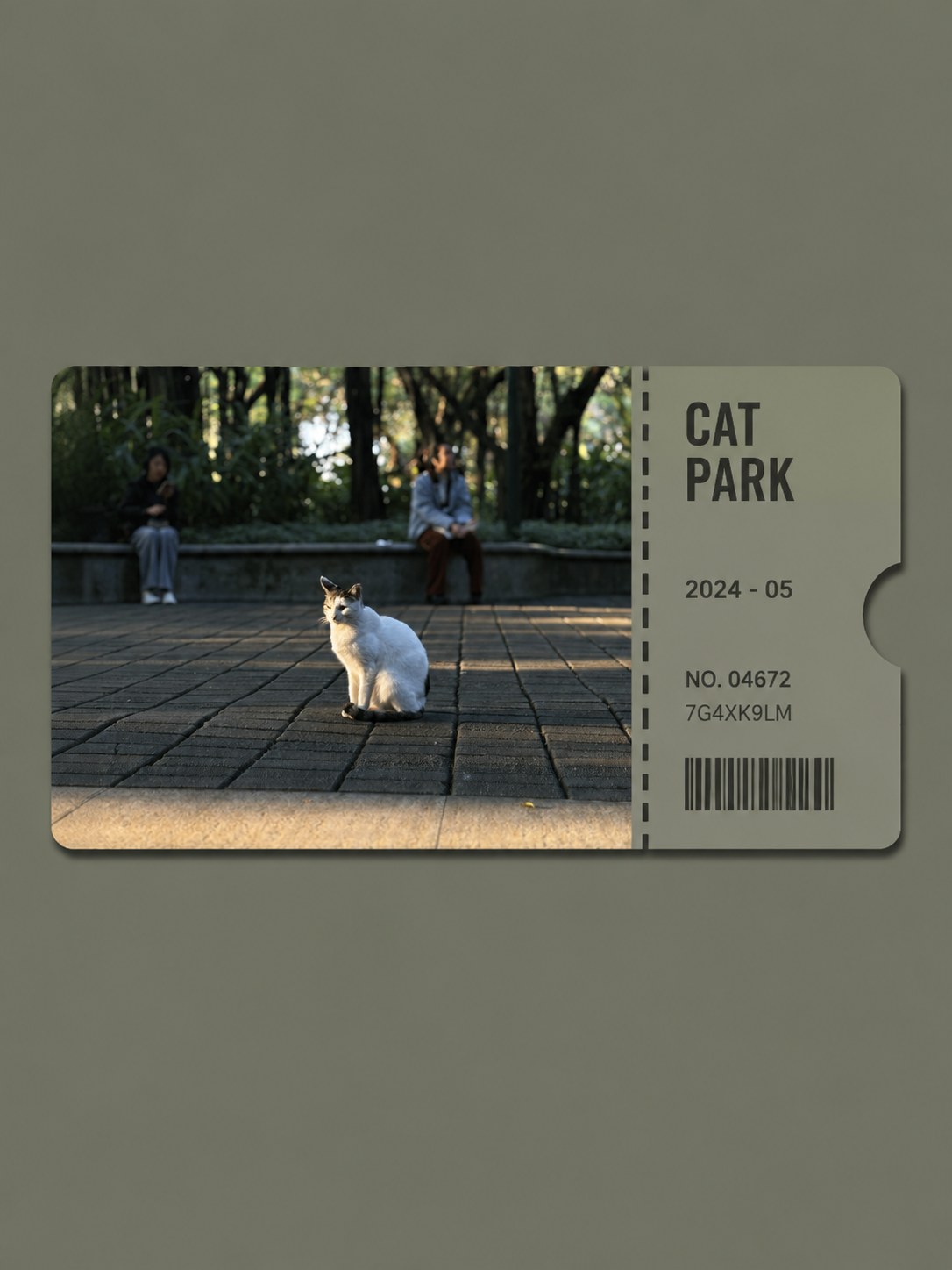
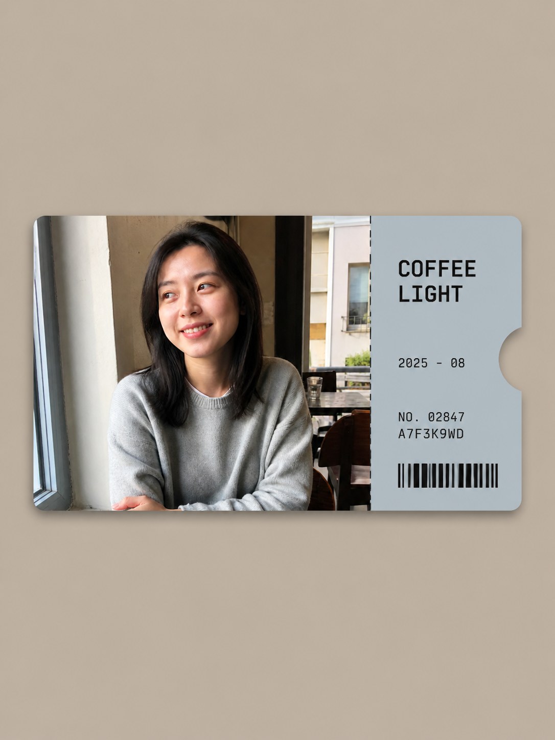
Where this style came from
Reverse-engineered from ten finished reference images. Ten is a lot, and it showed — with that many samples the stable numbers are actually stable, so this prompt carries tighter tolerances than the styles we built from three.
The ticket is 89–91% of the canvas width and 32–34% of its height, sitting at roughly 2.1:1, with 31–33% blank above and 34–36% below. Those are not aesthetic preferences; they are what ten samples agreed on. The asymmetry — slightly more space below than above — is in every reference, and reproducing it is most of why the result looks composed rather than merely centred.
The rules that took real thought were the textual ones. A ticket layout has slots that beg to be filled with a place and a date, and a model will fill them confidently and wrongly. So: the two-word title has to be a visible subject plus a visible attribute, never a proper place name unless it is legible in the photograph; the date uses the actual generation month rather than being inferred from snow or foliage; the serial rows and barcode are declared decorative, with no claimed real-world meaning.
The last constraint is about presentation. Every instinct in image generation pulls toward showing a ticket at an angle, in a hand, on a wooden table, with a dramatic shadow. The prompt bans all of it. The ticket is shown front-on as a flat designed object, and the quiet field around it is doing as much work as the ticket itself.
What is in the prompt
- The field
- One horizontal ticket floating on a quiet solid-colour background sampled from your photo. 68–72% of the canvas stays exposed background — the emptiness is what makes it read as a designed object.
- The ticket
- Exactly one ticket near the optical centre, about 2.1:1, level and front-facing. Gently rounded corners, one very soft neutral shadow. Flat and thin — never a 3D mockup held in a hand.
- Your photo
- The left 72–74% of the ticket is one edge-to-edge crop of your photo, kept photographic. It is never repainted, illustrated or globally stylised — only cropped to fit, never stretched or outpainted.
- The stub
- The right quarter is a solid accent colour drawn from the photo. It holds exactly five things: a two-word title, a date row, two serial rows and one barcode. No logo, icon, badge or QR code.
- Perforation and notch
- One vertical seam of 16–22 evenly spaced dashes separates photo from stub, plus exactly one semicircular notch cut from the outer right edge with the background showing through.
- The two-word title
- One concrete visible subject plus one visible setting, material, weather, colour or light word. At most 16 letters. It never uses a proper place name unless that name is unambiguously legible in your photo.
- What it refuses
- No tilted ticket, hand holding it, tabletop scene, tape, pins or folded corners. No gradient or pattern in the background. No serif, script or handwriting anywhere on the stub.
The full production prompt is built into generation and is not published.
Take the prompt with you
A distilled public version of this style. Paste it into any image model and swap {subject} for your own scene.
A 3:4 portrait presentation poster with exactly one horizontal collectible admission ticket centered on a quiet flat low-chroma background, the ticket featuring {subject}. Left three quarters of the ticket: one edge-to-edge realistic photographic panel of the scene with a restrained editorial grade. Right quarter: one solid-color information stub in an accent hue related to the scene, holding only an uppercase two-word geometric sans-serif title, one "YYYY - MM" date row, two small monospaced serial rows ("NO. 00000" and an eight-character code), and one decorative barcode. A straight perforation seam of short dashes divides photo and stub, and one clean semicircular notch is cut from the outer right edge. Gently rounded corners, one very soft drop shadow, the ticket kept level and front-facing. Calm, collectible, contemporary — no tilt, no hands holding it, no extra decorations, no invented place names.
Example subject: a turquoise alpine lake beneath snow ridges
Good for / not for
Works well
- Travel and landmark photos with a clear subject
- Landscape-oriented shots — the photo panel is horizontal
- Concerts, exhibitions, trips you want a keepsake for
- Photos with one strong colour to drive the stub
Not this one
- Tall vertical photos — they get cropped hard into a 2:1 panel
- Group photos where cropping will cut someone out
- Very dark photos with no colour to sample for the stub
- Photos whose whole point is the full frame
Common questions
What are the serial numbers?
Decorative. They are fictional ticket identifiers with no real-world meaning, and the barcode is not scannable — it carries no booking, pricing or location data.
Can I set the title or the date?
Not in this style — it writes the two-word title from what it sees and uses the current month when you have not supplied one. It will not infer a date from foliage, snow or clothing.
Is my photo altered?
Only cropped and lightly graded. The prompt forbids repainting, illustrating or stylising it, and forbids outpainting beyond your original frame.