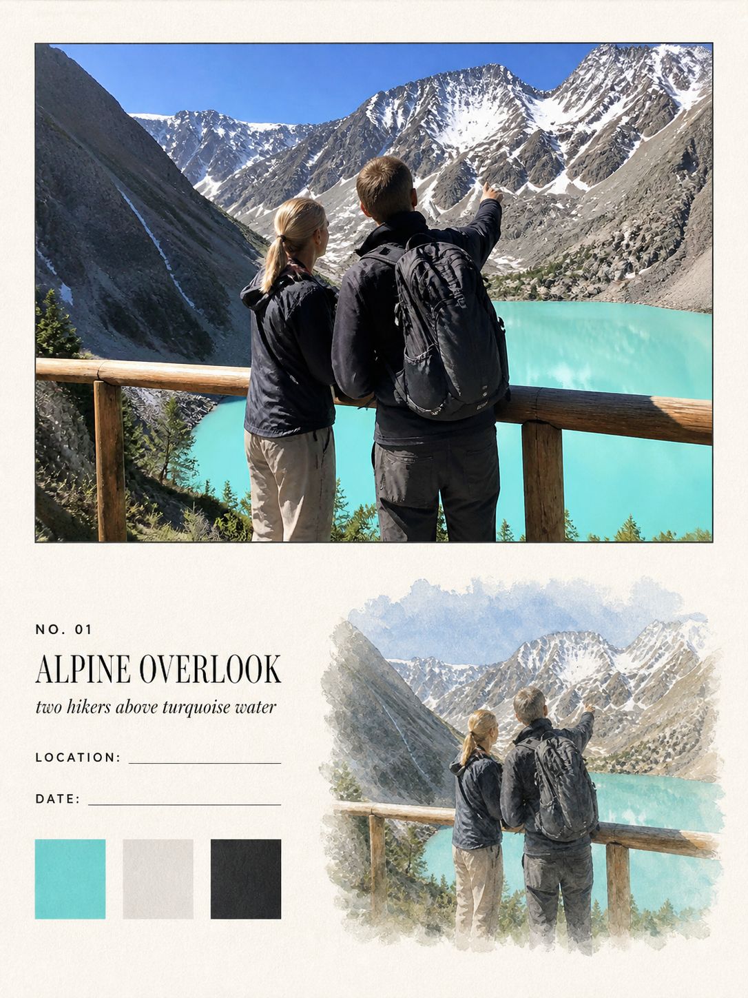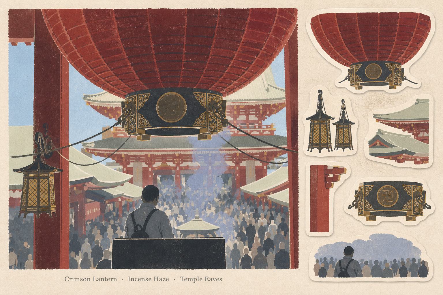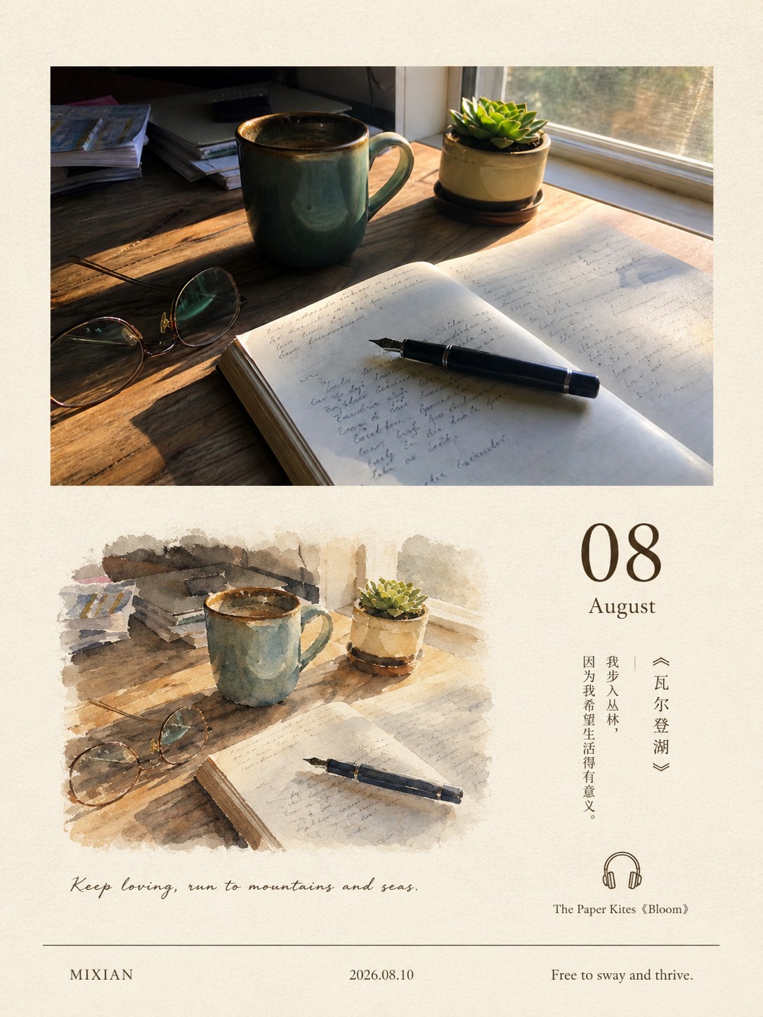
Hand-drawn Notes
Torn-paper journal
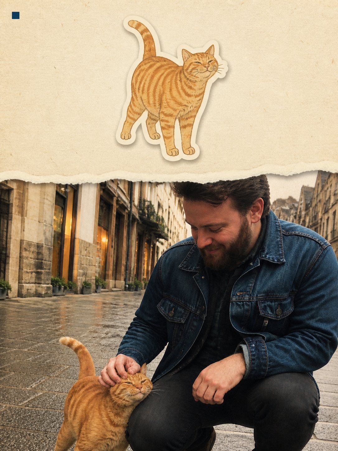
Photo and paper split by one hand-torn edge
- Ratio
- Original, 3:4, 4:5, 1:1, 9:16, 4:3, 16:9 or 2.35:1
- Options
- Signature
- Origin
- Reverse-engineered from reference images
- GitHub skill
- Install for Codex ↗
Each generation costs credits — see your balance in My space.
Create with this styleSamples
Real generations, not mockups.
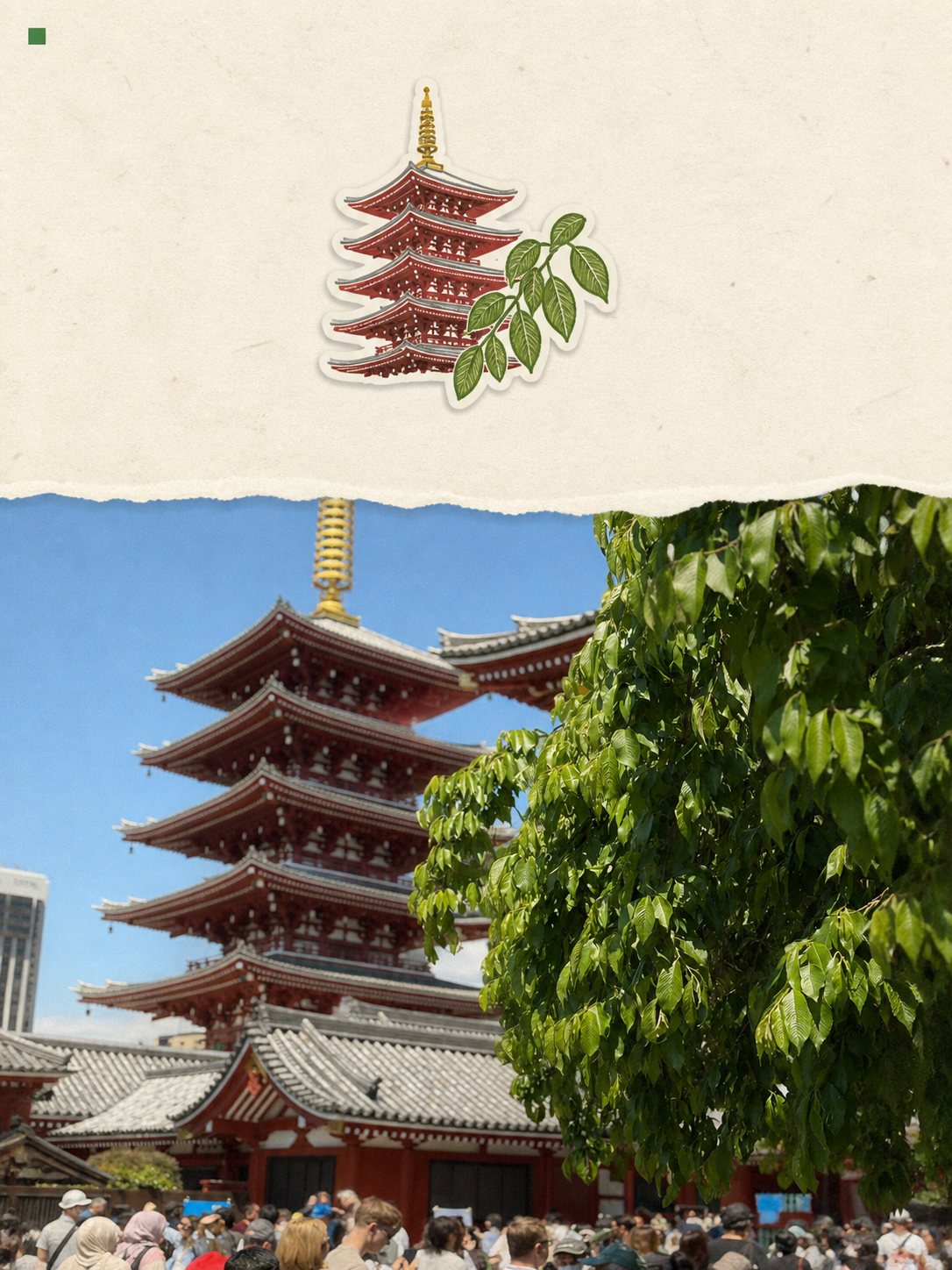
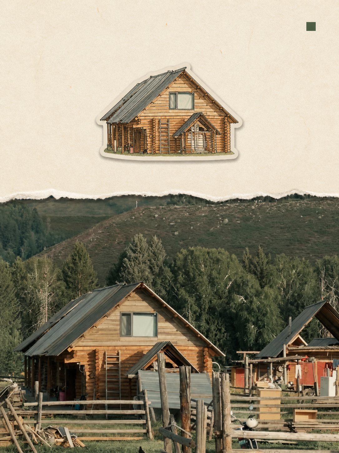
Where this style came from
Six finished images, no prompt. Same situation as the watercolour field note, and the same method: measure everything, write the stable parts as ranges, and pay attention to what the references consistently refuse to do.
Two things turned out to be load-bearing. The first is that the photo/paper order flips — in three references the photo is on top, in three it is on the bottom. That is not noise; it is the layout adapting to the picture. So the prompt tells it to choose whichever placement protects the main subject and never covers a face, rather than fixing the order.
The second is the single accent colour. Every reference picks one dark hue out of the photograph and uses it for both the label text and one small square marker. Nothing else on the page is coloured that way. It is a small rule that does most of the work of making a photo and a drawing look like they belong on the same sheet.
The hard constraint we added ourselves is about wording. Scrapbook layouts invite a model to write a city name, and a model asked for a city name will produce one whether or not it knows. The prompt now says: use text only when the user supplied it or it is unambiguously legible in the photo, and otherwise preserve the negative space. A blank corner is a correct answer here. “Firenze, Italy” under a photograph taken in Lisbon is not.
What is in the prompt
- The split
- One full-width photo panel and one full-width paper panel, each 45–55% of the canvas. The photo goes top or bottom — whichever placement protects the main subject.
- The torn edge
- One continuous irregular boundary across the full width, with visible soft fibres and 1–3% height variation. It has to look physically torn — not scalloped, not cut with scissors, not digitally masked.
- One sticker
- Exactly one coherent sticker cluster drawn from the clearest anchor in your photo — a building, a chair, a storefront. It may hold one to three related objects but must read as a single sticker.
- One accent colour
- A single dark colour is picked from the photo and used for both the text and one small solid square marker. That one colour running through the page is what holds it together.
- Text
- At most one two-line label: a subject or place title, then "City / Country". Typewriter-style monospace, flush to an outer corner of the paper, never over the photo.
- Verified wording only
- The label appears only when the wording is supplied by you or is unambiguously legible in the photo. It never guesses a city, country or landmark — if it cannot verify, it leaves the space empty.
- What it refuses
- No tape, pushpins, stamps, maps, tickets, polaroid frames, doodles or arrows. Minimal analog scrapbook, not a busy craft collage. 35–45% of the canvas stays bare paper.
The full production prompt is built into generation and is not published.
Take the prompt with you
A distilled public version of this style. Paste it into any image model and swap {subject} for your own scene.
A 3:4 portrait travel-journal collage of {subject}. One half of the canvas is a natural documentary photograph of the scene with a mild warm-faded grade; the other half is warm ivory handmade paper with fine fibers, and the two meet along one continuous irregular hand-torn paper edge with visible soft fibers. On the paper panel sits exactly one hand-drawn die-cut sticker of the scene's most distinctive object — a simplified gouache and colored-pencil illustration in two to four muted colors with a warm-white sticker border and a soft paper shadow — plus a small two-line typewriter-style label ("Place / Country") in one dark accent color with a tiny solid square marker beside it. 35-45% of the canvas stays as quiet paper. No tape, stamps, doodles or scrapbook clutter.
Example subject: a yellow tram turning past an old street corner in Lisbon
Good for / not for
Works well
- Travel photos with one strong architectural or object anchor
- Cafes, storefronts, chairs, signage shapes
- Street scenes where a single object carries the memory
- Photos where you know the place name and want it printed
Not this one
- Wide landscapes with no single object to turn into a sticker
- Group photos and crowds
- Photos where you cannot verify the place name — the label just disappears
- Frames that are already visually busy edge to edge
Common questions
Why did my photo end up on the bottom?
The prompt lets it choose top or bottom by which placement protects the main subject and never covers a face. Both arrangements appear in the reference set, so both are correct.
Why is there no place label on mine?
Because it could not verify one. The rule is to omit rather than guess — a journal page with the wrong city on it is worse than one with empty paper. Supply the signature text option if you want wording you control.
Can I get more than one sticker?
No. One cluster is the design. The reference images that produced this style all had exactly one, and the negative space around it is what keeps the page from looking like craft-store output.