Hand-drawn Notes
Watercolor field note
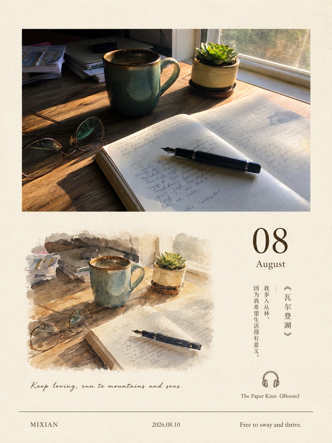
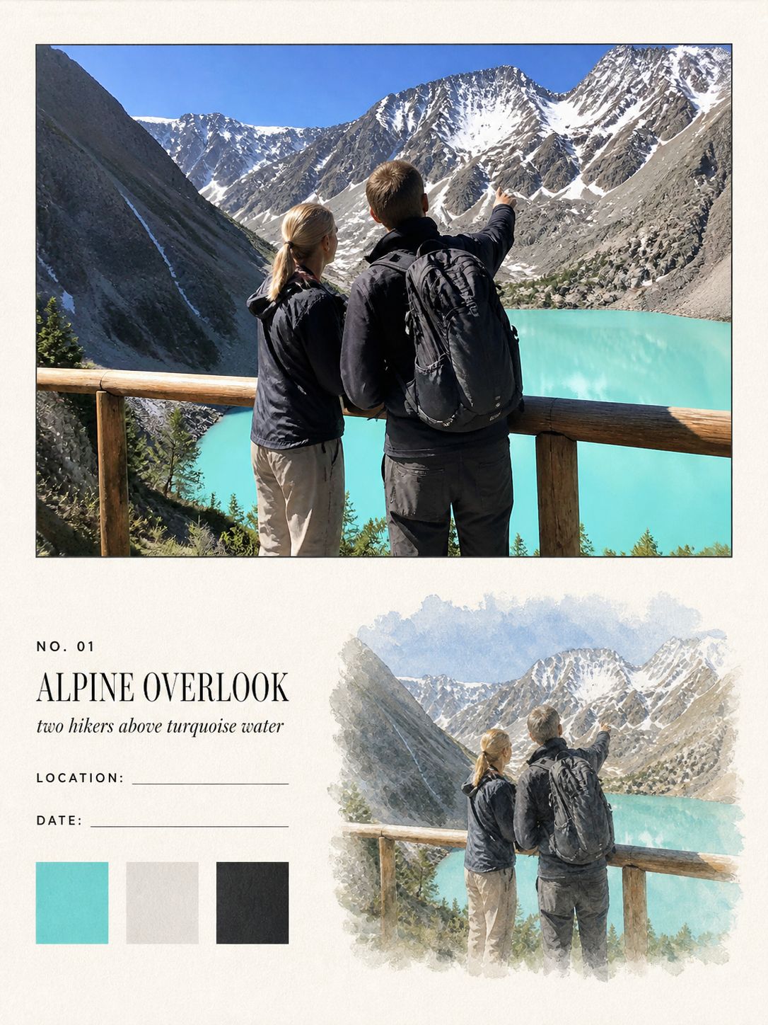
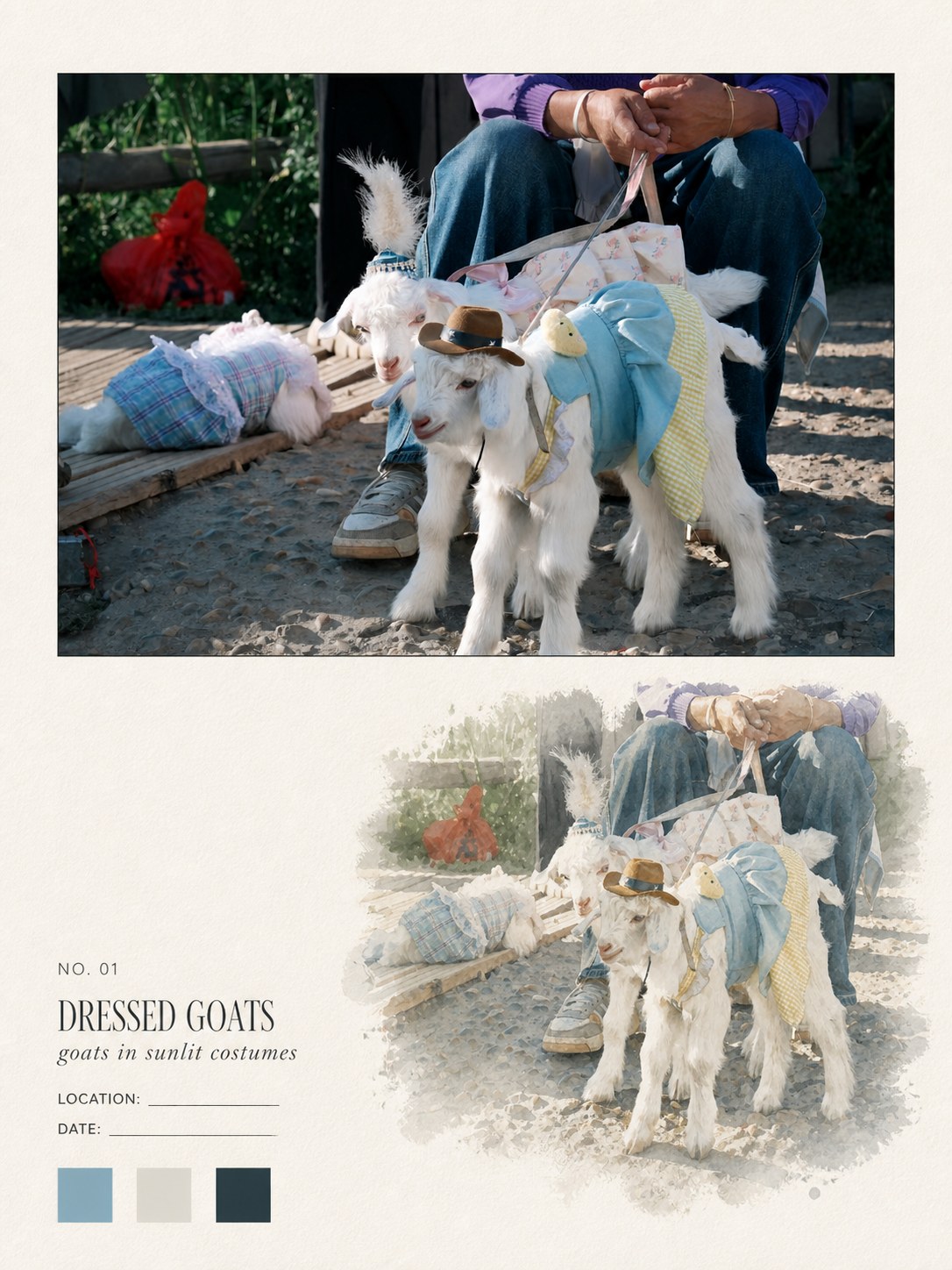
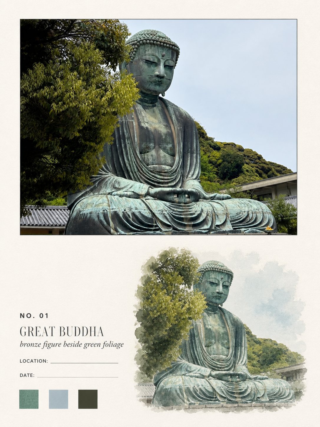
Your photo above, the same scene in watercolour below
- Ratio
- Original, 3:4, 4:5, 1:1, 9:16, 4:3, 16:9 or 2.35:1
- Options
- Place name, Date, Plate caption
- Origin
- Reverse-engineered from reference images
- GitHub skill
- Install for Codex ↗
Each generation costs credits — see your balance in My space.
Create with this styleSamples
Real generations, not mockups.
Where this style came from
There was no upstream prompt for this one. We were given three finished images — a sandbar shot from the air, a snow peak, a shallow bay with two turtles — and had to work backwards from them.
Reverse-engineering a layout from finished output is mostly measuring. Across the three plates the photo panel sat between 43% and 52% of the canvas height, the watercolour between 44% and 53% of the width, and roughly a third of every page was untouched ivory. Those ranges are in the prompt as ranges, not as single values, because three samples cannot tell you where inside the range the original author actually aimed.
The important discovery was structural rather than dimensional. On all three plates the watercolour reproduces the same scene as the photograph — same number of people, same turtles, same spatial relationships — rather than being a decorative painting placed nearby. Get that wrong and the whole thing reads as a stock illustration pasted under a travel photo. So the prompt says it twice: preserve the source scene’s identity, once photographically and once as watercolour.
The other thing the references made obvious was what they never did: on all three, the LOCATION and DATE rules were empty. That is a design decision, not an oversight — a field note that guesses where it was made is worthless. The prompt now forbids inferring either from scenery, and both are user-supplied options instead.
What is in the prompt
- Structure
- One large photo panel across the top, taking 43–52% of the height. The lower 45–54% is an editorial field on ivory paper. The photograph is never repainted or filtered.
- The watercolour echo
- One unframed watercolour of the same scene sits lower-right. It keeps the same subject count, silhouettes, spatial relationships and viewing angle — it is the same picture painted, not a decorative illustration.
- How it dissolves
- 70–85% of the watercolour’s perimeter has to be soft, dry-brushed, broken or pigment-feathered. No rectangular frame, no sticker outline, no hard photographic edge.
- Colour
- Four to seven colour families sampled from the photo, kept 10–25% less saturated than the photograph. Three square swatches under the text block sample a mid hue, a pale neutral and a dark anchor.
- Typography
- Lower-left only: a plate number, a two-to-five-word uppercase title, an optional italic subtitle, and empty LOCATION / DATE rules. Museum-caption register, never handwritten.
- No guessing
- Location and date stay blank unless you supply them — the prompt explicitly forbids inferring either from scenery. If a title cannot be formed confidently, it falls back to a neutral subject class like "COAST".
- What it refuses
- No full-canvas redraw, no watercolour filter over the photo, no torn paper, tape, stamps or maps, no second photographic duplicate, no gouache or marker in the watercolour area.
The full production prompt is built into generation and is not published.
Take the prompt with you
A distilled public version of this style. Paste it into any image model and swap {subject} for your own scene.
One 3:4 portrait editorial field-note plate about {subject} on warm ivory watercolor paper. Top: a large realistic photograph-style panel of the scene with a single hairline charcoal keyline, square corners, no mat and no shadow. Lower-right: one unframed transparent-watercolor echo of the same scene — layered washes, pigment granulation, dry-brush passages, soft feathered edges dissolving into the paper. Lower-left: a restrained museum-caption text block — a small plate number "NO. 01", an uppercase Didone serif title naming the subject, an italic old-style serif subtitle, then "LOCATION:" and "DATE:" labels each followed by a blank rule — plus three small square color swatches sampled from the scene. Airy, archival, quiet, like a premium travel monograph.
Example subject: a white lighthouse on a rocky northern coast
Good for / not for
Works well
- Landscapes, coastlines, mountains, open water
- Wildlife and animals with a clear silhouette
- Scenes with two or three readable subjects
- Photos you want documented rather than transformed
Not this one
- Very busy frames — the watercolour has to simplify and loses the plot
- Close-up portraits, where a painted face rarely survives
- Night scenes with little colour to sample
- Photos already containing heavy text or signage
Common questions
Can I fill in the location and date?
Yes — those are two of the three text options this style exposes, along with the plate title. Leave them empty and the rules stay as blank lines, which is what the reference layout does.
Is my photo painted over?
No. The upper panel stays photographic and is only given a restrained editorial grade. The painting is a separate, second rendering of the same scene in the lower field.
Where did this style come from?
It was reverse-engineered from three finished reference images — there was no prompt to start from, so every number in it is an estimate read off those three plates.