Image Distill
Sunlit travel sketch
The whole scene re-inked as an animation background
- Ratio
- Original, 3:4, 4:5, 1:1, 9:16, 4:3, 16:9 or 2.35:1
- Options
- None
- Origin
- Reverse-engineered from reference images
- GitHub skill
- Install for Codex ↗
Each generation costs credits — see your balance in My space.
Create with this styleSamples
Real generations, not mockups.
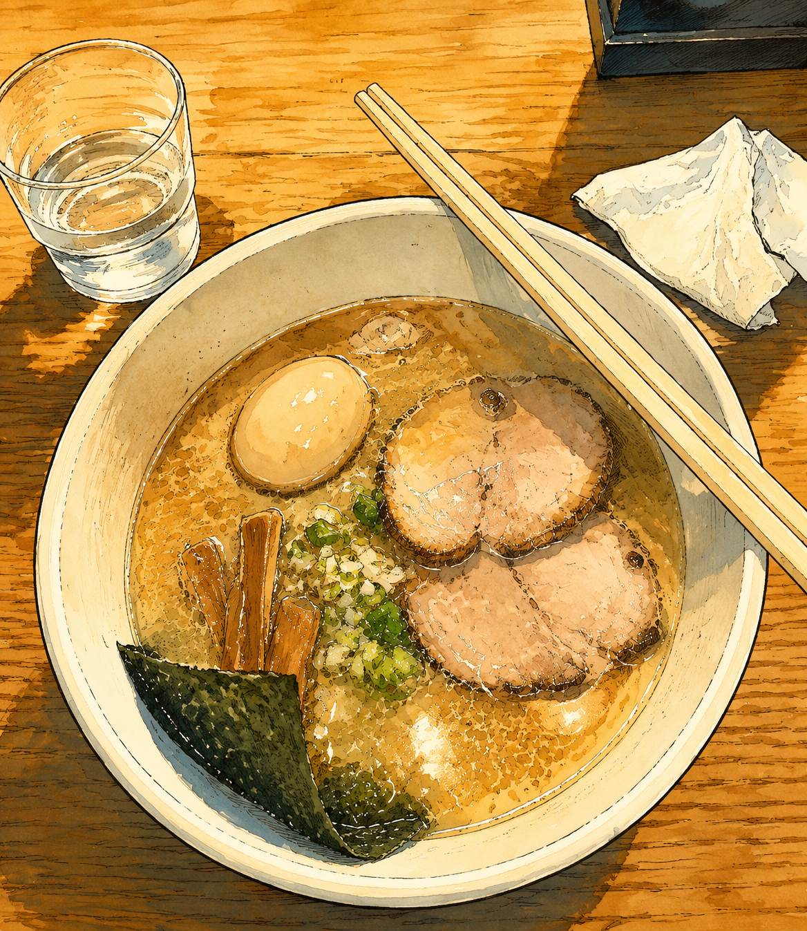
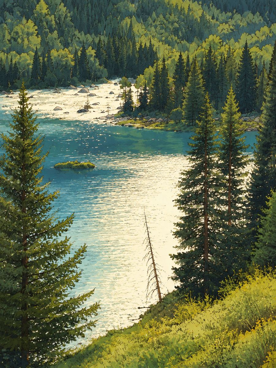
Where this style came from
Reverse-engineered from three finished reference images, with no prompt to start from. The look is animation-background illustration — hand-inked contours, cel-style colour blocking, summer light — and the difficulty was not describing the look. It was stopping the model from redecorating.
Styles that redraw an entire scene have a characteristic failure: they replace what is actually in your photo with what usually appears in pictures of this kind. Ask for a sunlit travel sketch and you get a blue sky, a bicycle, a lemon-yellow cup, some handwritten notes and a Japanese street sign — regardless of what you uploaded. Every one of those appeared in early tests, and none of them were in the source photos.
So a large part of this prompt is a list of things it must not add, named individually. Zero new decorative objects. Every cloud, plant, drink, sign and piece of furniture has to be traceable to the supplied photo. No forced blue sky, no invented sunbeams, no East Asian signage unless that exact content is present. It is an unglamorous way to write a prompt and it is what makes the output actually about your picture.
The positional constraints do the same job from the other side: each principal subject stays within roughly 5% of its source position and 10% of its source size. Without numbers there, “keep the composition” drifts a little every run until the scene is somebody else’s.
What is in the prompt
- Medium
- Slightly imperfect pen-and-ink contours over crisp cel-like colour blocking, with a restrained gouache wash texture. Linework uses dark charcoal, deep blue-green or muted sepia — never pure black.
- Your photo is the blueprint
- Subject count, identity, silhouette, pose, viewpoint, horizon and overlap order all carry over. Each principal subject stays within about 5% of its original position and 10% of its original size.
- Depth
- The scene is organised into two to four readable depth planes. Foreground and midground get the highest line density; contrast and detail drop off progressively into the distance.
- Light
- The photo’s actual time of day and weather are preserved. Sunlight is strengthened only modestly — an overcast picture does not become a sunny one, and the light direction never moves.
- Text in the scene
- No title, caption or signature is added. Text appears only where text-bearing surfaces already exist in your photo — signs, packaging, notebook pages — and stays on its original surface in the original script.
- Nothing invented
- Exactly zero new decorative objects. Every cloud, plant, bicycle, sign and cup has to be traceable to your photo. If a word cannot be verified it is left as unresolved line texture rather than guessed.
- What it refuses
- No retained photography or photo collage. No generic anime redesign, oversized eyes or beautification. No sky replacement, no scene extension, no cleaned-up clutter, no seasonal or weather change.
The full production prompt is built into generation and is not published.
Take the prompt with you
A distilled public version of this style. Paste it into any image model and swap {subject} for your own scene.
A full-canvas sunlit travel-diary illustration of {subject}, drawn like a hand-inked animation background. Slightly imperfect pen-and-ink contours in dark charcoal or muted sepia — never pure black — over crisp cel-style color blocking with a restrained gouache and transparent-wash texture. Simplify tones into three to six value steps per object, keep sunlit sides broad and clean with hard-edged cast shadows, and use warm cream instead of sterile white for highlights. Build the palette from five to eight color families with one cool dominant such as sky blue, blue-green or leaf green, and at most two warm accents like lemon yellow or terracotta. Organize the scene into two to four readable depth planes with the most line detail up front. Hand-observed, tactile, quietly nostalgic — no photo textures, no glossy concept-art rendering, no thick uniform comic outlines.
Example subject: a narrow old street with parked bicycles in morning sun
Good for / not for
Works well
- Street scenes with layered depth
- Interiors with a lot of specific stuff in them
- Daylight photos with clear direction of light
- Places you want remembered in full, not abstracted
Not this one
- Night and low-light scenes — the style is built around sunlight
- Tight portraits, where re-inking a face is risky
- Flat, empty frames with nothing to describe
- Photos where you actually want the background gone
Common questions
Will it turn my photo into anime?
No. The prompt bans generic anime redesign, oversized eyes, beautification, face replacement and anatomy changes by name. The reference is animation backgrounds, not character art.
Why is the signage in my photo still there?
Because it was in your photo. The style keeps existing text on its original surface and in its original script — up to six prominent regions — rather than inventing or translating anything.
What ratio do I get?
Choose original (the default), 3:4, 4:5, 1:1, 9:16, 4:3, 16:9 or 2.35:1. The layout adapts to your selected canvas.