Image Distill
Soviet-era poster
Vintage offset print, 1957–1980 mood
- Ratio
- Original, 3:4, 4:5, 1:1, 9:16, 4:3, 16:9 or 2.35:1
- Options
- None
- Origin
- Distilled from an open-source GitHub skill · plbbl/soviet-cold-war-aesthetic
- GitHub skill
- Install for Codex ↗
Each generation costs credits — see your balance in My space.
Create with this styleSamples
Real generations, not mockups.
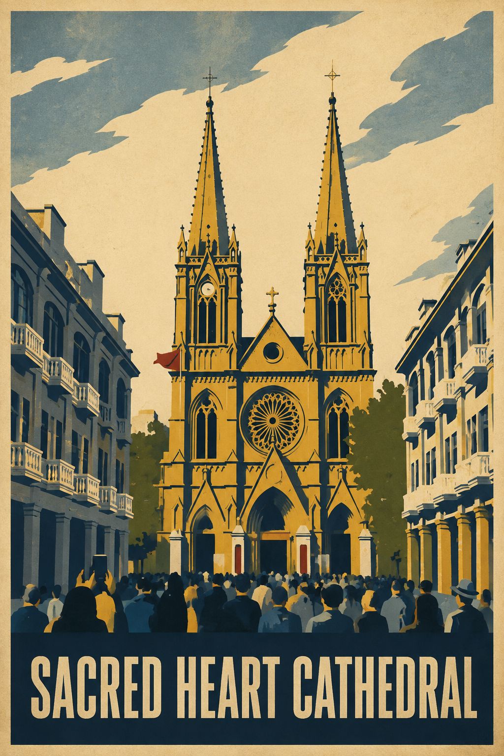
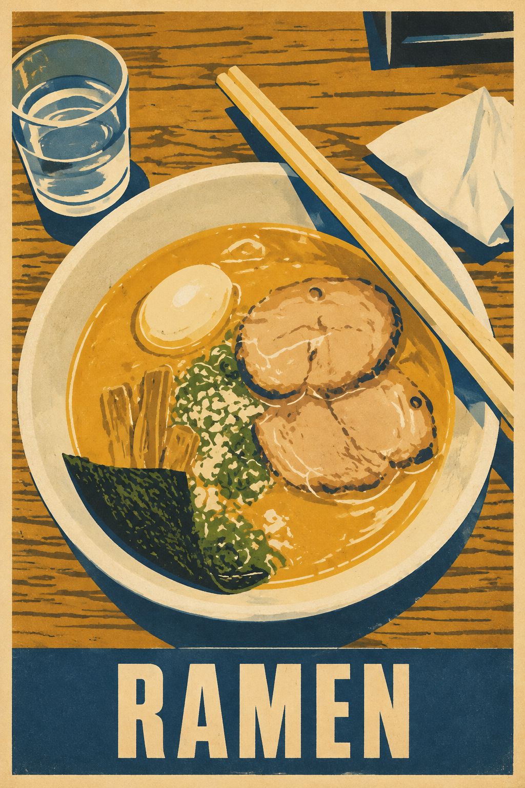
Where this style came from
Distilled from an open-source skill for Cold War era poster aesthetics. The upstream repository had done the historical work already — the ink palette with its specific hex values, the offset printing artefacts, the 1957–1980 window — and left us a prompt that mostly needed structuring rather than research.
The one genuinely useful thing we added was register selection. A poster style applied uniformly produces the same composition for a mountain, a factory and a bowl of soup, which is precisely wrong: mid-century public printing had distinct genres, and the graphic treatment followed the subject. So the prompt now tells the model to look at the photo first and pick one of three registers — travel, public construction, or consumer goods — before it starts simplifying. Output quality improved more from that one branch than from any adjustment to the palette.
The other decision was subtractive and deliberate. The upstream aesthetic sits close to a body of imagery we do not want to reproduce, so the prompt bans hammer-and-sickle motifs, red stars, political leaders, all political symbolism and wartime imagery, and forbids reproducing any actual historical poster. What is left is the printing: flat separations, restrained halftone, misregistration, ink wear on warm cream stock. That is the part worth borrowing.
What is in the prompt
- It picks a register
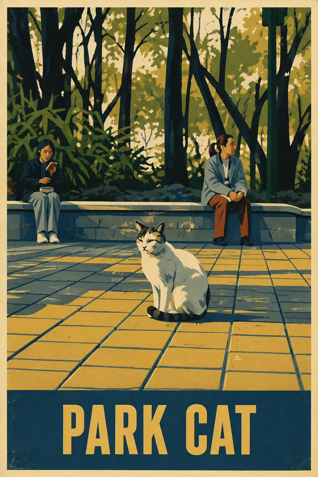
- It reads the photo first and chooses which kind of poster to make: landscapes and landmarks become Intourist travel posters, people working become public-construction posters, food and objects become public-goods promotion.
- Flat colour modules
- The scene reduces to four to six large, flat, hard-edged colour blocks with a clear reading hierarchy. The main subject has to stay recognisable at thumbnail size.
- Palette
- Four to six inks total: aged cream paper, print black, deep navy, blue-grey, olive, ochre. Red appears only as one or two small accents — never as the dominant field.
- Print artefacts
- Vintage offset on warm cream stock: hard flat separations, restrained halftone, fine paper fibre, slight registration misalignment, light ink wear. Muted and tactile, never neon.
- If there are people
- They become simplified flat-colour poster figures that keep their recognisable pose, clothing and facial likeness — simplified, not anonymised or replaced.
- One title
- Exactly one English title, two to four words, all caps, bold condensed vintage sans, in a single narrow band at the top or bottom. It plainly names what is in the photo, spelled perfectly. No other text anywhere.
- What it refuses
- No hammer-and-sickle, no red stars, no political leaders, no political symbols, no wartime battle imagery, and no reproduction of any actual historical poster.
The full production prompt is built into generation and is not published.
Take the prompt with you
A distilled public version of this style. Paste it into any image model and swap {subject} for your own scene.
An original Soviet Cold War era poster, circa 1957-1980, of {subject}, in the manner of vintage offset lithographic public graphics. Reduce the scene to four to six large flat hard-edged color modules with one dominant diagonal or vertical direction; the subject must read instantly at thumbnail size. Palette of four to six inks on warm aged-cream paper: print black, deep navy, blue-grey, olive green, ochre golden yellow, with red appearing only as one or two small accents. Vintage print artifacts: crisp cut shapes, restrained halftone, fine paper fiber, slight registration misalignment and light ink wear — muted and tactile, never neon. One short ALL CAPS English title in bold condensed vintage sans-serif sits in a narrow band at the bottom, plainly naming the subject, spelled perfectly. Keep a thin warm-paper margin around all four edges. No political symbols, no photorealism, no gradients, no modern ad aesthetics.
Example subject: a red cable car climbing over a pine valley
Good for / not for
Works well
- Landmarks, city views and travel scenes
- Industrial subjects, machines, bridges, infrastructure
- Food and everyday objects shot cleanly
- Photos with strong, simple geometry
Not this one
- Busy scenes that will not reduce to six colour blocks
- Close-up portraits — poster simplification is unkind to faces
- Photos whose appeal is subtle colour or soft light
- Anything you want to look contemporary
Common questions
Does it add Soviet political symbols?
No. Hammer-and-sickle, red stars, political leaders and all political symbolism are banned outright in the prompt, as is wartime imagery. The reference is the graphic language of mid-century public printing, not its politics.
Where does the title text come from?
The model writes it from what it sees — two to four words plainly naming the subject. You cannot set it yourself in this style. If it misspells, regenerate; the prompt demands perfect spelling but cannot guarantee it.
Can I get a landscape poster?
Choose original (the default), 3:4, 4:5, 1:1, 9:16, 4:3, 16:9 or 2.35:1. The layout adapts to your selected canvas.