Hand-drawn Notes
Monthly zine postcard
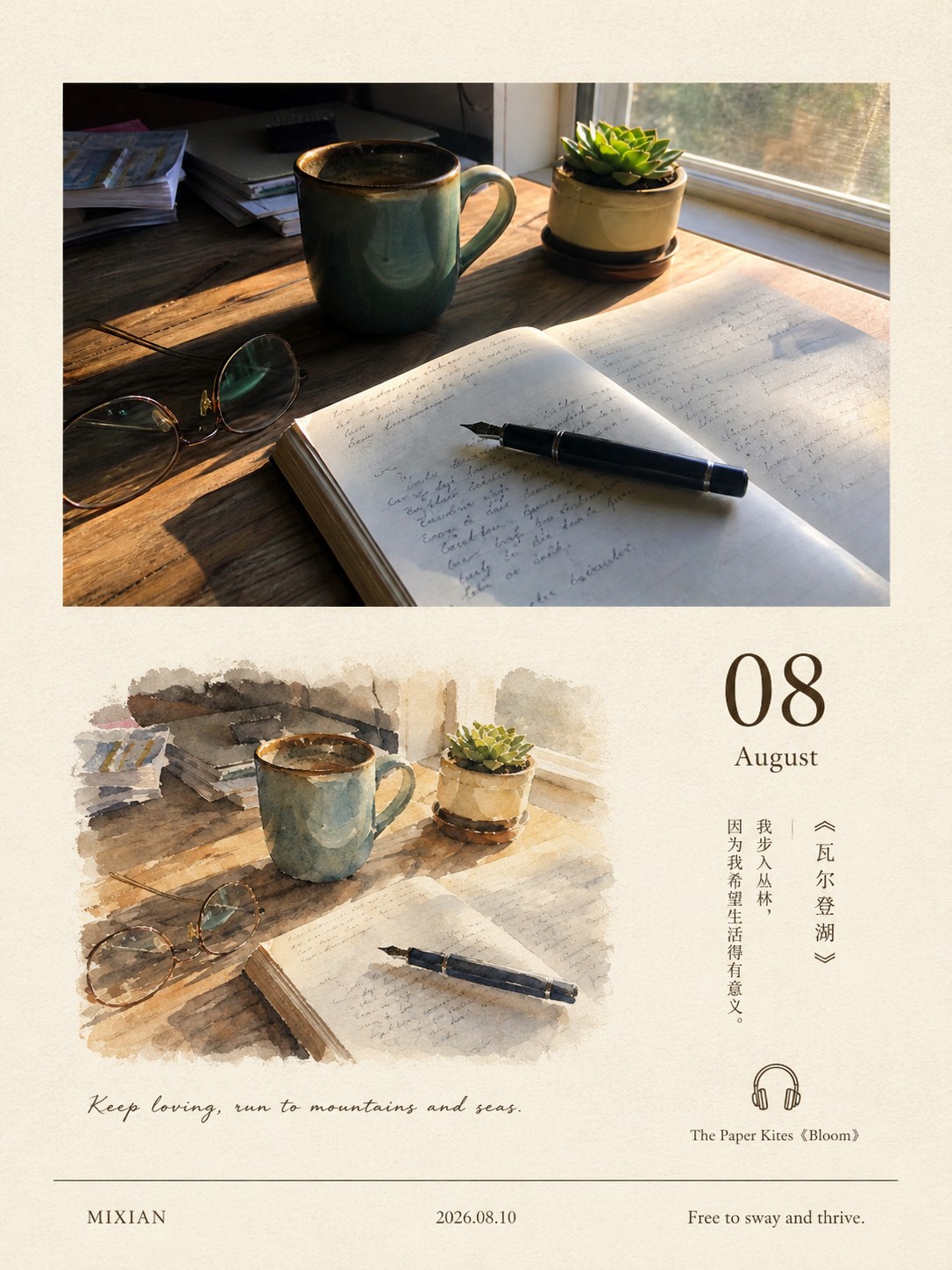
Your photo whole on top, a monthly page below
- Ratio
- Original, 3:4, 4:5, 1:1, 9:16, 4:3, 16:9 or 2.35:1
- Options
- Month, Handwritten line, Footer left, Footer centre, Footer right
- Origin
- Distilled from an open-source GitHub skill · shenchangyi/photo-to-monthly-zine-postcard
- GitHub skill
- Install for Codex ↗
Each generation costs credits — see your balance in My space.
Create with this styleSamples
Real generations, not mockups.
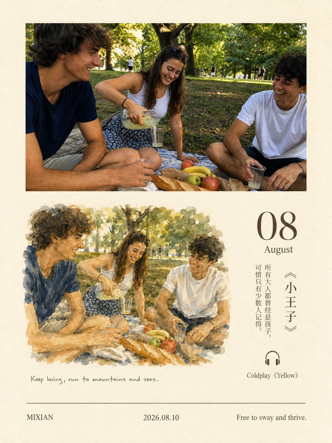
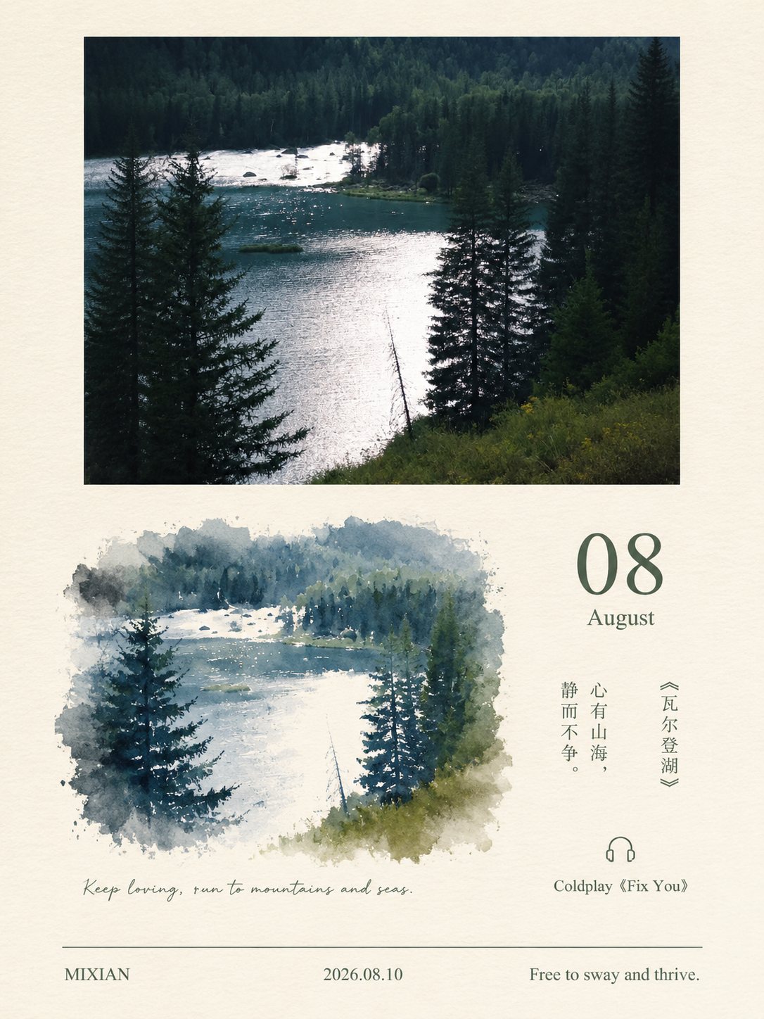
Where this style came from
Distilled from an open-source skill on GitHub, whose repository came with an unusual amount of structure: a layout spec, a content-curation document and a quality gate, all separate from the skill file itself. Most of what we did was collapse four documents into one single-pass prompt.
The hard problem in this style is not visual, it is factual. The bookmark column asks for a real book with a real quotation and a real song, chosen to match the photograph. A model asked for a quotation will produce one whether or not it has the wording right, and a misattributed line under someone’s holiday photo is a small but real harm.
The upstream skill handled this with a curation document. We compressed it into a matching rule with a stated threshold — the book and song must match at least two of five named dimensions — plus an explicit fallback: when nothing fits, write a short original caption with no attribution, and leave the music line blank rather than inventing a song. Silence is a permitted output here.
The layout rule worth knowing about is the photo sizing. Rather than a fixed height, the photo gets a different proportion depending on whether it is landscape, square or portrait, so that the ivory margins around it always read as deliberate editorial space rather than as an accident of aspect ratio. That one branch is why the same layout survives a panorama and a phone portrait.
What is in the prompt
- Your photo, whole
- The complete photo sits in the upper area, contained and centred — never cropped, stretched, repainted or recoloured. Even a built-in frame or EXIF strip is kept exactly as-is.
- Sized by shape
- How much height the photo gets depends on its own shape: a wide landscape becomes a strip at 29–34% of card height, a square about 35–38%, a portrait 40–42% fitted by height.
- The watercolour block
- Upper-left of the lower page: one watercolour-and-ink block with free organic edges, no frame. It repaints only the core relationship of your photo — subject, space, light — as one loose source-specific painting.
- The bookmark column
- The right quarter holds three groups on one axis: a large two-digit month with its English name, a book title in 《》 with a short quotation, and a headphone icon above one artist and song line.
- How it picks them
- The month is chosen to match the visible season and light. The book and song must match at least two of: subject, light or time of day, stillness or motion, emotional direction, colour temperature.
- Never invented
- The book and quotation have to be real and correctly attributed. When nothing fits, it falls back to a short original caption with no attribution, and leaves the music line blank rather than inventing a song.
- Footer
- One thin rule near the bottom with three aligned fields beneath it — a signature, a date and a closing line. Nothing else may touch the footer.
The full production prompt is built into generation and is not published.
Take the prompt with you
A distilled public version of this style. Paste it into any image model and swap {subject} for your own scene.
A portrait 3:4 monthly zine postcard on warm ivory paper with subtle uniform grain, built around a photo of {subject}. Upper area: the photograph shown whole and untouched, centered with generous ivory margins reading as editorial space. Lower area: one miniature horizontal monthly-magazine page — at the upper-left a loose unframed watercolor-and-ink block repainting only the scene's core subject, space and light with free organic edges; beneath it one short handwritten-style line; on the right an airy bookmark column with a large two-digit month number above the English month name, a vertical book title in 《》 paired with a short quotation, and a tiny headphone icon above one "artist《song》" line. A thin footer rule with three small aligned fields closes the page. One muted dark text color sampled from the photo is used throughout; every letter razor-sharp; no calendar grid, no stickers, no clutter.
Example subject: an August afternoon at a quiet beach
Good for / not for
Works well
- Photos with a clear season or time of day
- Quiet scenes that suit a literary pairing
- Any shape — the layout adapts its sizing to it
- Monthly or diary-style posting
Not this one
- Photos where you need the book or song to be exactly right
- Very busy images the watercolour cannot reduce
- Scenes with no readable season or light cue
- Anything where added literary text would feel wrong
Common questions
Are the book and song real?
The prompt requires them to be real and correctly attributed, and to fall back to an unattributed original line when nothing fits. It is still a model choosing from memory, so check anything you plan to post publicly.
Can I set the month and the handwritten line?
Yes — the month, the handwritten line and all three footer fields are user options. Leave them empty and the style picks the month from the visible season and light.
Is my photo cropped?
No. This is the one style that keeps the photo completely whole — the generous ivory margins around it are intentional editorial space, not a mistake.