Hand-drawn Notes
Gathered scenes zine
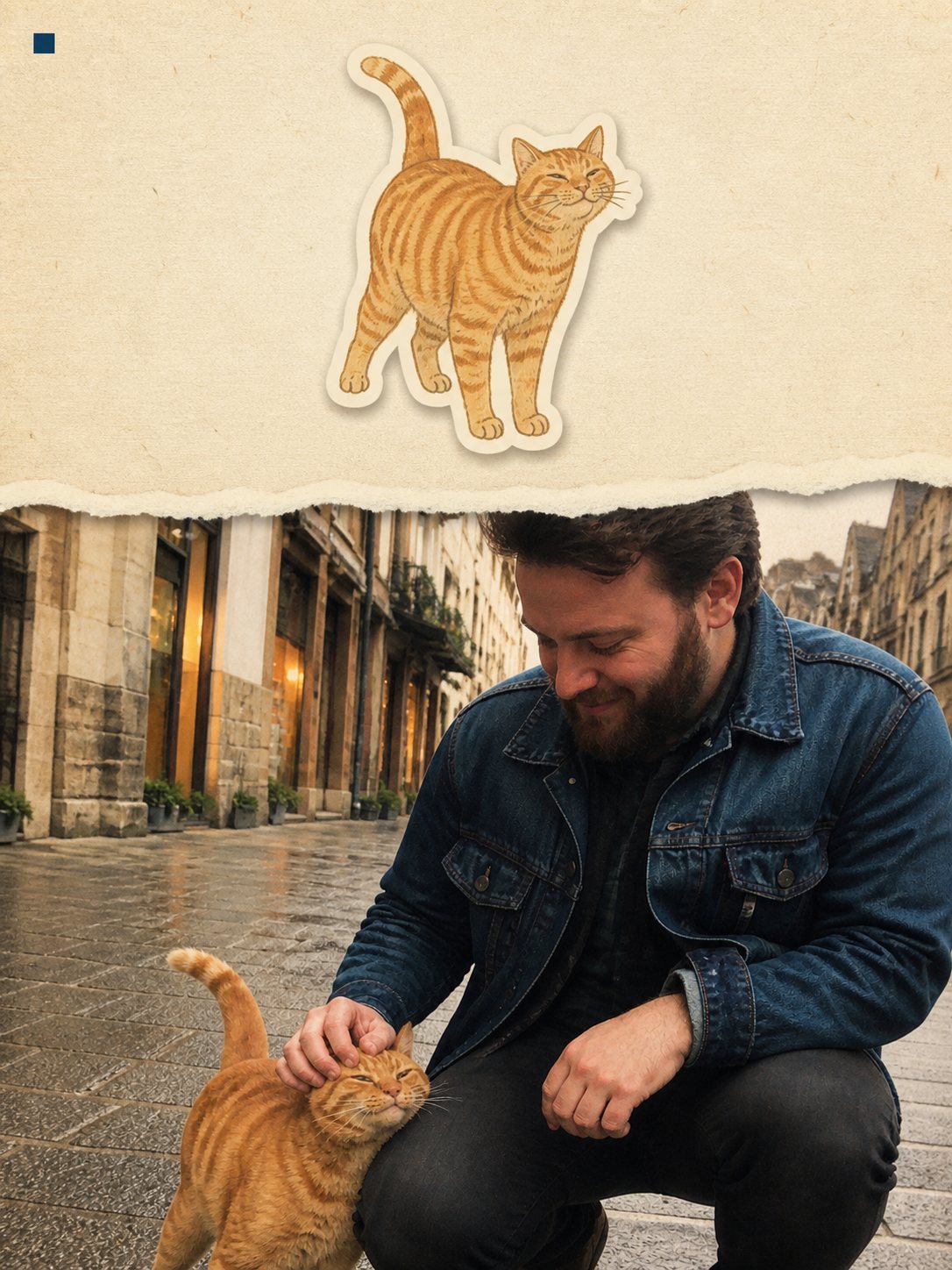
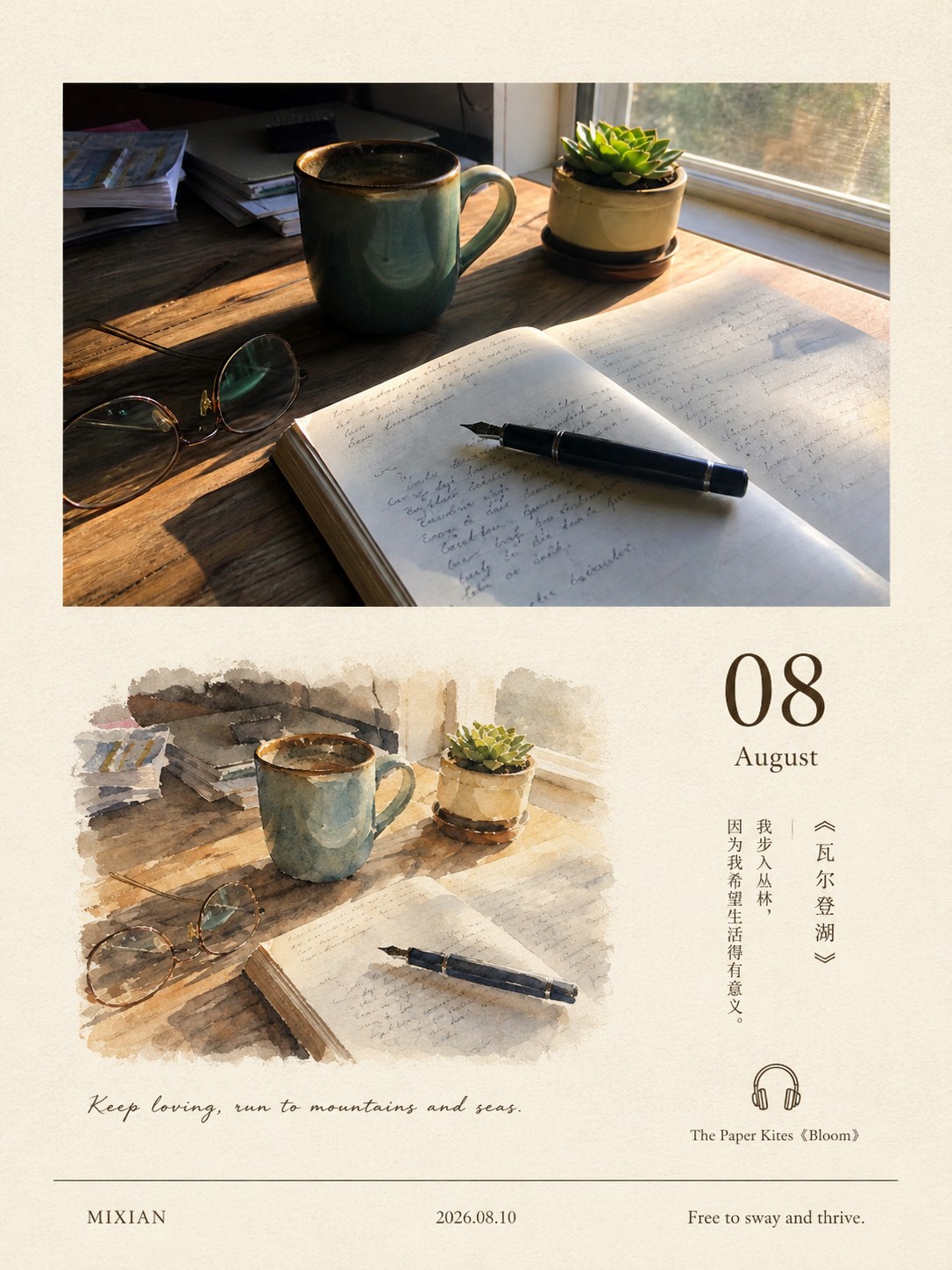
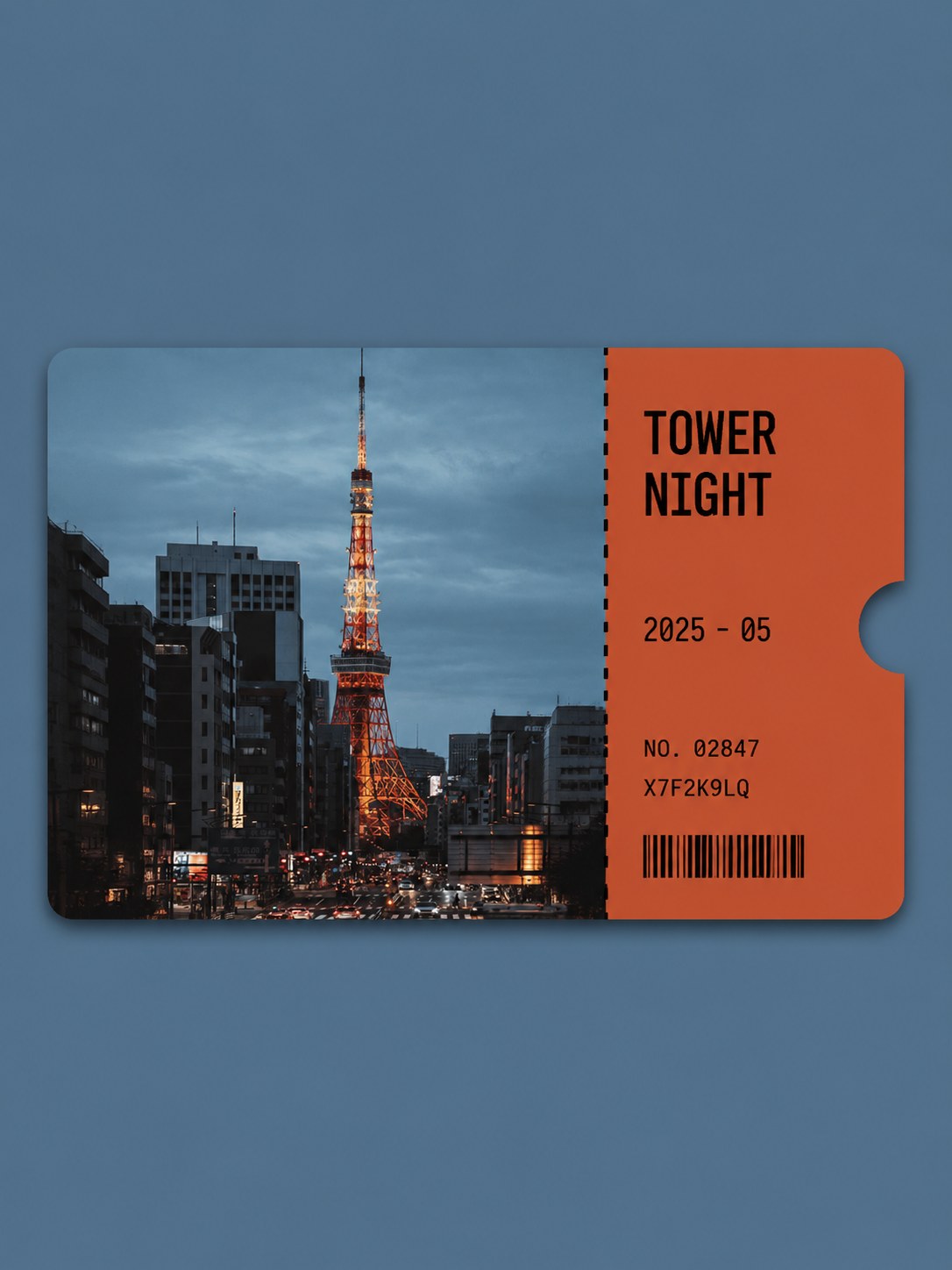
One torn piece of your photo, the rest redrawn on paper
- Ratio
- Original, 3:4, 4:5, 1:1, 9:16, 4:3, 16:9 or 2.35:1
- Options
- None
- Origin
- Distilled from an open-source GitHub skill · GitHub · Zeejay0/gathered-scenes-zine-skill v1.3
- GitHub skill
- Install for Codex ↗
Each generation costs credits — see your balance in My space.
Create with this styleSamples
Real generations, not mockups.
Where this style came from
Distilled from Zeejay0’s open-source Gathered Scenes Zine skill, v1.3. The upstream skill is written for an agent that can look at its own output and try again — it carries a fifteen-step workflow, a targeted-correction table, and a quality gate of forty-odd questions. This site makes one call to an image model, with no chance to look and retry, so the distillation moved every check that could become visible pixels forward into the prompt itself: the density percentages, the torn-edge perimeter ratio, the single-hue rule, the five-word text limit. What was left behind was the loop.
The other change was the ratio. The original locks a 3:5 sheet; this site offers a fixed set of shapes and 3:5 is not among them, so the first version ran at 3:4. The editor now also offers original plus all seven preset ratios. Two rounds of testing on the same set of photographs said the layout survives that swap without losing the paper’s room to breathe.
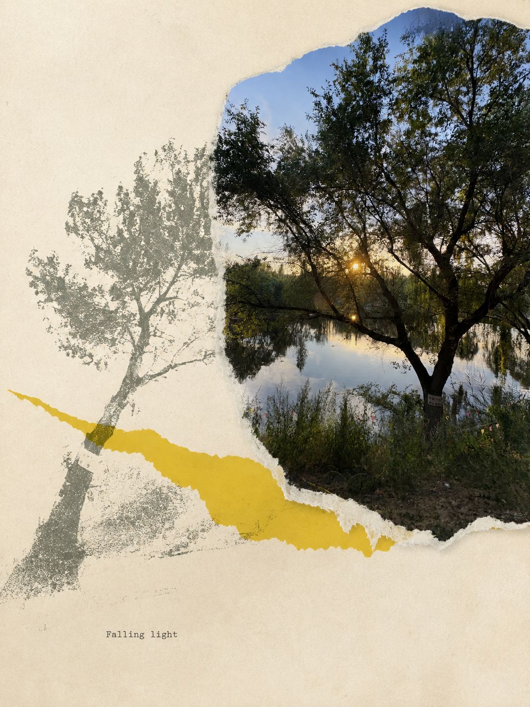
Two failures showed up in the first round and both were worth the fix. On a backlit river photograph the model screened the entire frame into a halftone print — technically a collage, but with no truthful photograph left anywhere in it, which is the one thing this style cannot lose. On a photograph of a cat it parked a red rectangle in the top-left corner, touching nothing. The rule against detached colour blocks existed, but it was sitting at the bottom of a long list of things to avoid, where it carried no weight. Both rules were moved to the front of their sections and stated as hard constraints, and both failures went away.
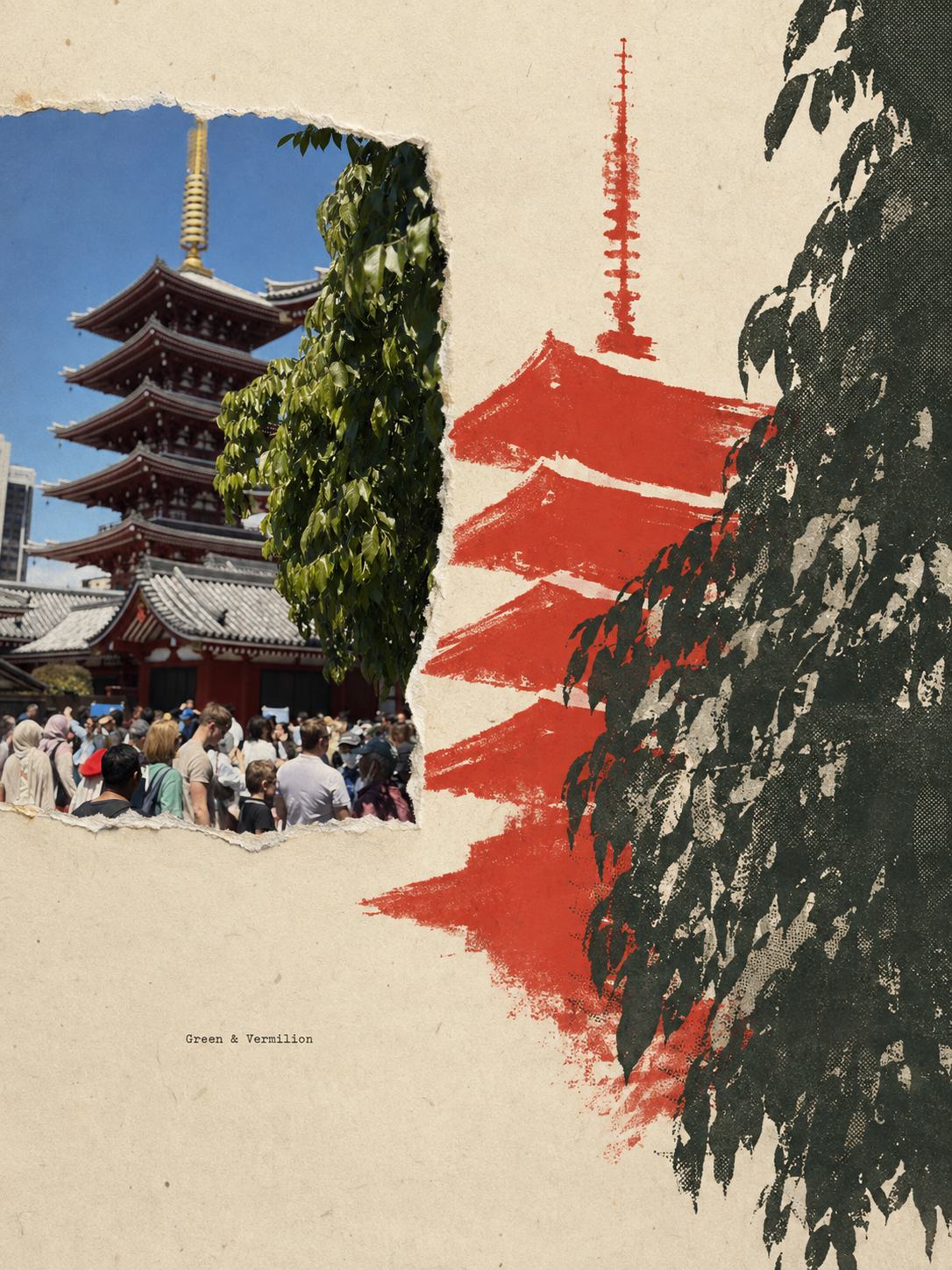
The style is a good argument for compression as a design decision rather than a technical one. A photograph of a temple with a wall of leaves in front of it will produce, on a first attempt, an illustration that draws leaves — hundreds of them, in filigree, until the paper looks like lace and reads as noise at thumbnail size. The prompt therefore says the opposite of what the source image suggests: the denser the photograph, the fewer marks the paper gets, and the larger they should be.
What is in the prompt
- The photographic anchor
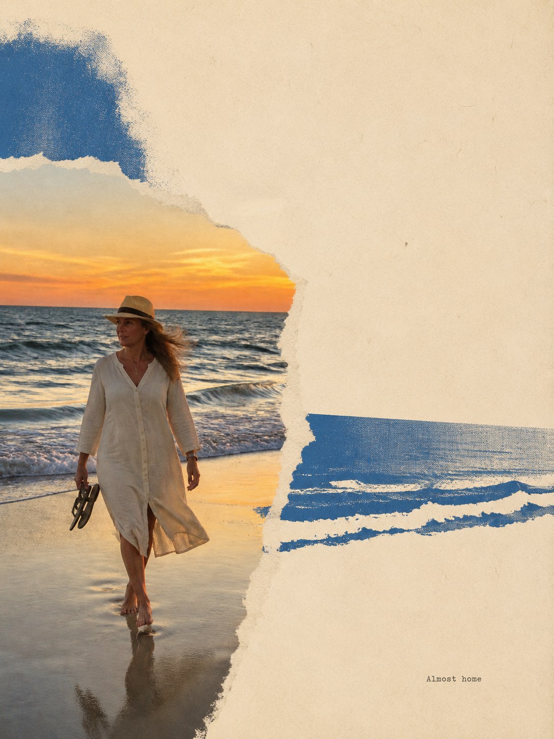
- Roughly 30-45% of the poster stays as your untouched photograph — real colour, real texture, real faces. It is never screened, engraved or posterised, so there is always a visible material difference between the photo and the printed paper around it.
- Everything else gets compressed
- The surrounding illustration reinterprets the same scene instead of tracing it: 60-80% of small detail removed, repeated forms merged into larger masses, and one primary drawing grammar rather than every print process at once.
- Dense detail gets compressed hardest
- Foliage, crowds, gravel and repeated texture must read calmer in the drawing than in the photo — one main mass, one to three directional gestures, and 85-95% of the individual marks omitted. Complexity in the photograph is a reason to print less, not more.
- One saturated hue, doing structural work
- Exactly one added print colour, built on a shape taken from your photo — a roofline, a road, a shadow, a garment. It has to touch or cross the image. A block of colour parked alone in a corner is treated as a failure, however small.
- A hand-torn paper edge
- Where photograph meets paper there is an irregular ripped contour with a narrow fibre fringe, running along 35-70% of the visible photo perimeter — never a uniform decorative frame, never torn equally on all four sides, and never a clean digital cut-out.
- One line of micro-text
- A single English line of five words or fewer, set as a small typewriter imprint in a quiet paper area — a standalone word, a short keyword sequence, or a compact phrase. No date, no place name, no caption, no headline.
The full production prompt is built into generation and is not published.
Take the prompt with you
A distilled public version of this style. Paste it into any image model and swap {subject} for your own scene.
A vertical 3:4 paper zine poster about {subject} on warm cream aged paper, presented as a flat matte scan with faint weathering and light scan noise. Two materials share one sheet: a truthful photographic anchor of the scene, about a third of the poster, bounded by a visible hand-torn fibrous paper edge; and a much larger abstract paper-illustration field that reinterprets the same scene in flat ink, broken contour, sparse hatching and cut-paper shapes — with most of that field left as quiet unprinted paper. Add exactly one saturated print hue, such as cobalt blue, tomato red or vivid pear green, built on a shape taken from the scene and physically touching or passing behind the photo or illustration — never a floating color swatch. One tiny line of typewriter-style micro-text of five words or fewer rests in a quiet paper pocket. Tactile, flat, quiet, non-commercial — no scrapbook clutter, no glossy digital finish.
Example subject: a fishing village pier in morning fog
Good for / not for
Works well
- Scenes with a clear quiet area — sky, water, a wall, an empty foreground
- Travel and street photographs where the place matters more than the pose
- Images with one strong direction: a horizon, a path, a diagonal, a gaze
- Photos you want kept honest rather than restyled
Not this one
- Tightly cropped photos with no empty area for paper to occupy
- Group shots where every face must stay large and legible
- Screenshots, documents, or anything whose value is readable text
- Photos you want fully transformed — here most of the frame stays real
Common questions
Why is part of my photo still just a photo?
That is the point of the style. It works by contrast — a truthful fragment of the real scene set against paper that has been redrawn. If the whole frame were printed the same way, it would read as a filter rather than a collage.
Can I choose the colour it adds?
Not yet. The colour is picked from your photo's own palette by relationship — an analogous hue for harmony, a complementary one for counterpoint, or a warm accent in a cool scene. Letting it be chosen freely tends to break that relationship.
Can the text be in Chinese?
Not in this version — the line is English only. Chinese and a bilingual pairing exist in the original skill and are the most likely thing to be added here later.