Hand-drawn Notes
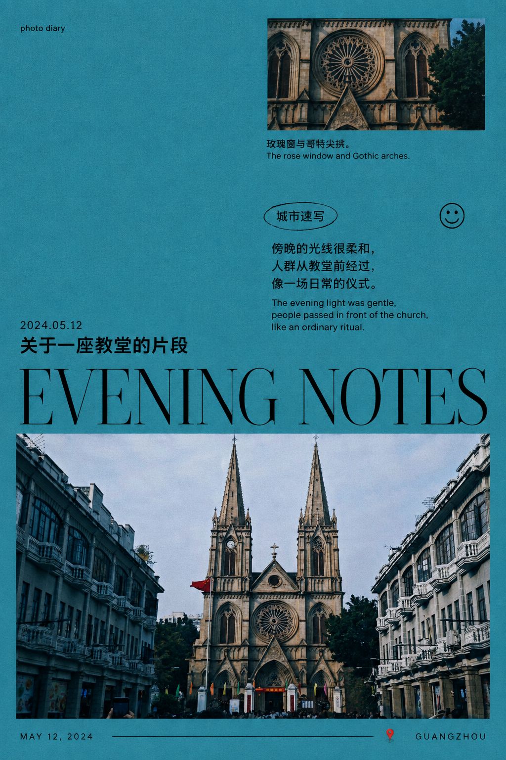
Blue-hour diary poster
A cool-blue zine cover for an ordinary evening
- Ratio
- Original, 3:4, 4:5, 1:1, 9:16, 4:3, 16:9 or 2.35:1
- Options
- Title, Diary line, Date, Place name, Credit line
- Origin
- Reverse-engineered from reference images
- GitHub skill
- Install for Codex ↗
Each generation costs credits — see your balance in My space.
Create with this styleSamples
Real generations, not mockups.
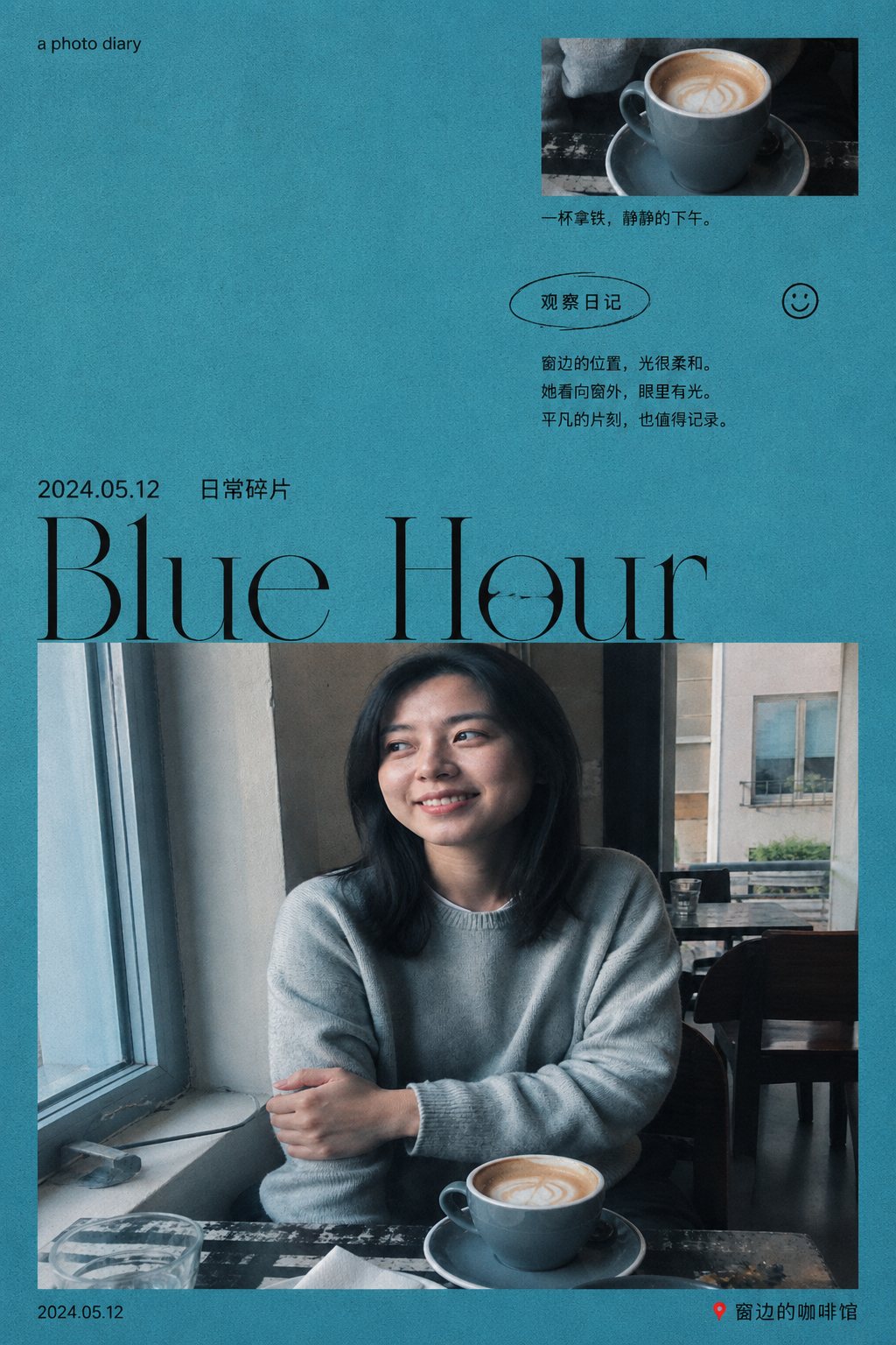
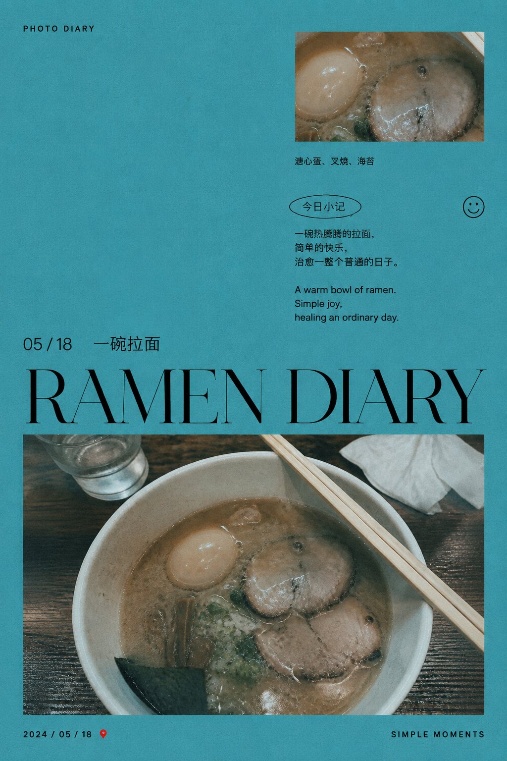
Where this style came from
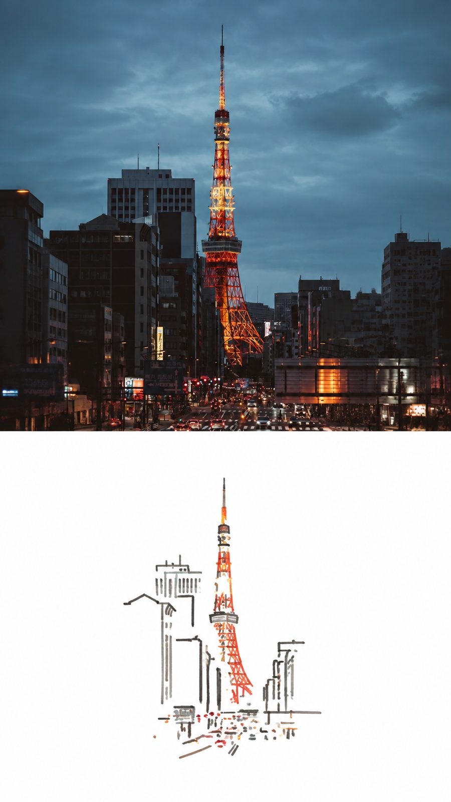
Reverse-engineered from two reference images — an original photograph and the finished poster made from it. Having the before and after of the same picture is worth more than several finished samples on their own: it shows exactly what was done to the photograph rather than leaving you to infer it.
What it showed was that almost nothing was done. The photo is cropped, given a cyan cast, slightly desaturated, softened and grained — and otherwise left alone. Perspective, motion blur and the small imperfections all survive. Every temptation to improve the photograph is declined, which is why the result reads as a printed page rather than a retouched image.
The layout is where the work is. An asymmetric modular grid, 30–40% of the canvas kept as bare cyan, at most two crops of the one photograph, and a top-to-bottom typographic rhythm that ends in an oversized title crossing the main image. The single most important rule is the crop count: given permission to use more, the model composes a collage, and the zine quality — one picture, looked at carefully — disappears immediately.
Because the reference was a screenshot, the prompt also has to say what not to reproduce: not the black preview surround, not the app interface, not the platform watermark. Models copy what they are shown, including the frame around it.
What is in the prompt
- Art direction
- A cool blue-hour diary look: quiet, observant, slightly nostalgic, laid out like an independent photography zine rather than an advertisement.
- The blue
- A flat matte cyan-teal paper field is the dominant colour, with near-black ink for all type and line art, and at most one tiny signal-red accent. No other accent palette is allowed.
- One photo, two crops
- Exactly one source photograph, used as at most two rectangular crops: a primary landscape crop near the bottom, and an optional small detail crop upper-right. The second is a genuine alternate crop, never a synthesised scene.
- Print treatment
- A mild cyan cast, slightly muted saturation, softened digital sharpness and fine risograph-like grain — applied to the crops only. Original perspective, motion blur and imperfections are preserved.
- The grid
- An asymmetric modular editorial grid with 4.5–6.5% outer margins, keeping 30–40% of the canvas as calm cyan negative space. Never a full-bleed photograph.
- Typographic rhythm
- Top to bottom: a tiny credit line, the optional detail crop with a short caption, an annotation cluster, a date-and-title line, then an oversized display title crossing the main crop.
- What it refuses
- No object removal or addition, no relighting, no sky replacement, no perspective change, no scene extension. No painterly brushstrokes and no distressed tears over the type.
The full production prompt is built into generation and is not published.
Take the prompt with you
A distilled public version of this style. Paste it into any image model and swap {subject} for your own scene.
A portrait editorial photo-diary poster in an A-series ratio about {subject}, designed like an independent Chinese photography zine. Dominant field: flat matte cyan-teal paper around #2995A8 with fine even risograph-like grain, with 30-40% kept as calm negative space. The scene appears as one primary landscape photographic crop near the bottom and one optional small detail crop at the upper-right — clearly photographic with a mild cyan-blue cast, muted saturation and analog grain, never repainted. Near-black ink typography on an asymmetric editorial grid: a tiny credit line, one short annotation cluster, one date-and-title line, one oversized very high-contrast Didone serif English title of one to four words crossing slightly into the photo, and a thin footer. At most three flat micro-decorations: a thin hand-drawn oval around a label, an outline smiley, one tiny red dot. Quiet, observant, slightly nostalgic.
Example subject: a harbor at blue hour with distant city lights
Good for / not for
Works well
- Evening and dusk photos, city light, water
- Quiet scenes that suit an observational caption
- Photos with a detail worth pulling out as a second crop
- Anything you have your own words for
Not this one
- Bright warm photos — the cyan cast fights them
- Portraits where the oversized title will cross a face
- Photos with no quiet area for type to sit in
- Images you want reproduced without a colour cast
Common questions
Can I write the title and the diary line myself?
Yes. This style exposes five text options — title, diary line, date, location and credit — so every piece of wording on the poster can be yours.
Why is my photo blue?
The cyan cast is the style. It is applied as a restrained printed-photo treatment across the crops, alongside muted saturation and riso-like grain. Warm whites in clouds and highlights are deliberately preserved.
Will it use two different photos?
No. There is exactly one source photograph. The upper-right detail crop, when present, is a second crop of that same image and never a synthesised second scene.